(Philadelphia, PA, August 25, 2020) – OddsChecker, the Flutter Entertainment-owned business has rebranded it’s sports betting odds comparison site in the United States https://www.oddschecker.com/us/ with an entirely new logo, tagline and inspiration for look and feel supported by Philadelphia’s own Xhilarate Branding and Design in collaboration with OddsChecker’s Marketing and Product teams.
Craig Balsdon, Head of OddsChecker’s International Product, explained: “We have been working tirelessly to adapt our product and brand to better serve the needs of our U.S. customers – both present and future – over the past nine months. As part of this we have undertaken multiple rounds of research with nearly 15,000 participants across the U.S. to allow us to better understand the needs of our users. And, tapping into Xhilarate, a U.S branding and design firm, to assist us with our rebranding efforts gave us a connection to a team who understood our customer base and the online sports betting market.”
“The OddsChecker / Xhilarate collaboration was a very close one from the start. They tapped into our knowledge of the U.S. consumer, our understanding of the sports market from a visual and messaging perspective and our ability to design with a “digital first” mindset” says Russ Napolitano, Partner, Client Relationship, Xhilarate. Russ continues to say “And, OddsChecker shared their vision, frequent market research insights and desire to create a brand and homepage user experience that embraces U.S customers’ needs.”
Xhilarate’s role in the OddsChecker rebrand program included several visual components that were integral in supporting OddsChecker’s Product team in creating a new user experience and brand identity.
The New Logo
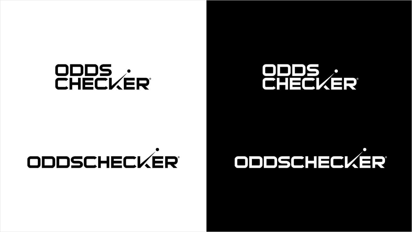
Xhilarate explored a range of logo options that would engage with the brand’s core customers. Since OddsChecker offers online odds comparisons for all sports, we needed a logo that would embrace a variety of sports and provide a level of confidence, optimism and energy.
The resulting logo is precise and modern and pushes both sophistication and savvy with pure energy. The split two-color white and bright green color scheme feels youthful and athletic, which is further embellished by the use of a collegiate-like font. Two icons add notoriety to the look. The “K” featuring an integrated check mark brings energy, action, optimism, and achievement, while the ball at the check mark’s tip creates a focal point and target of ambition.

Look and Feel
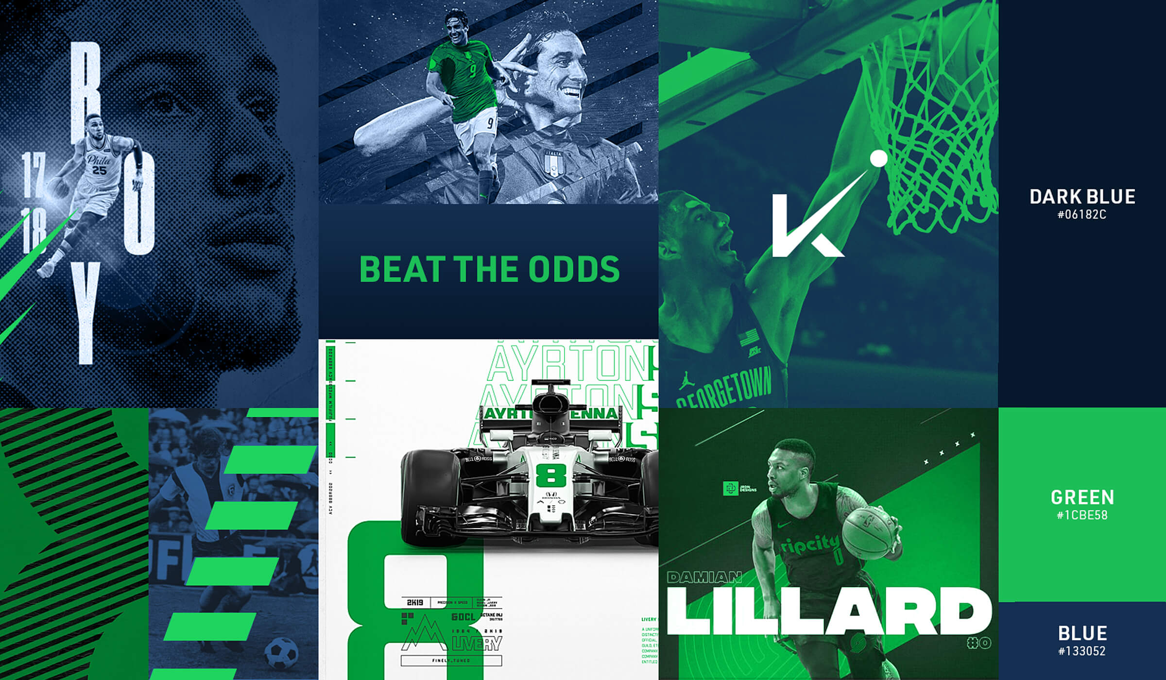
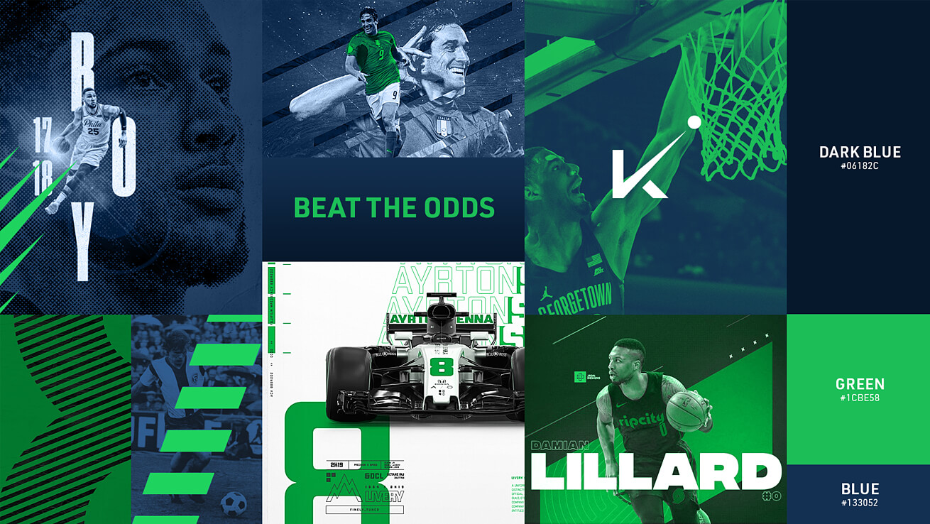
Our overall goal was to support OddsChecker in creating a brand that met the needs of OddsCheckers core target audience as conveyed through extensive market research. Knowing that most online sports betting occurs via mobile, we needed a look and feel that was bold, active, and easy to navigate. This meant the use of engaging photos of players in action, odds comparisons and scores that are easy to access, and just enough information to assist bettors with comparing odds and placing their bets with confidence.
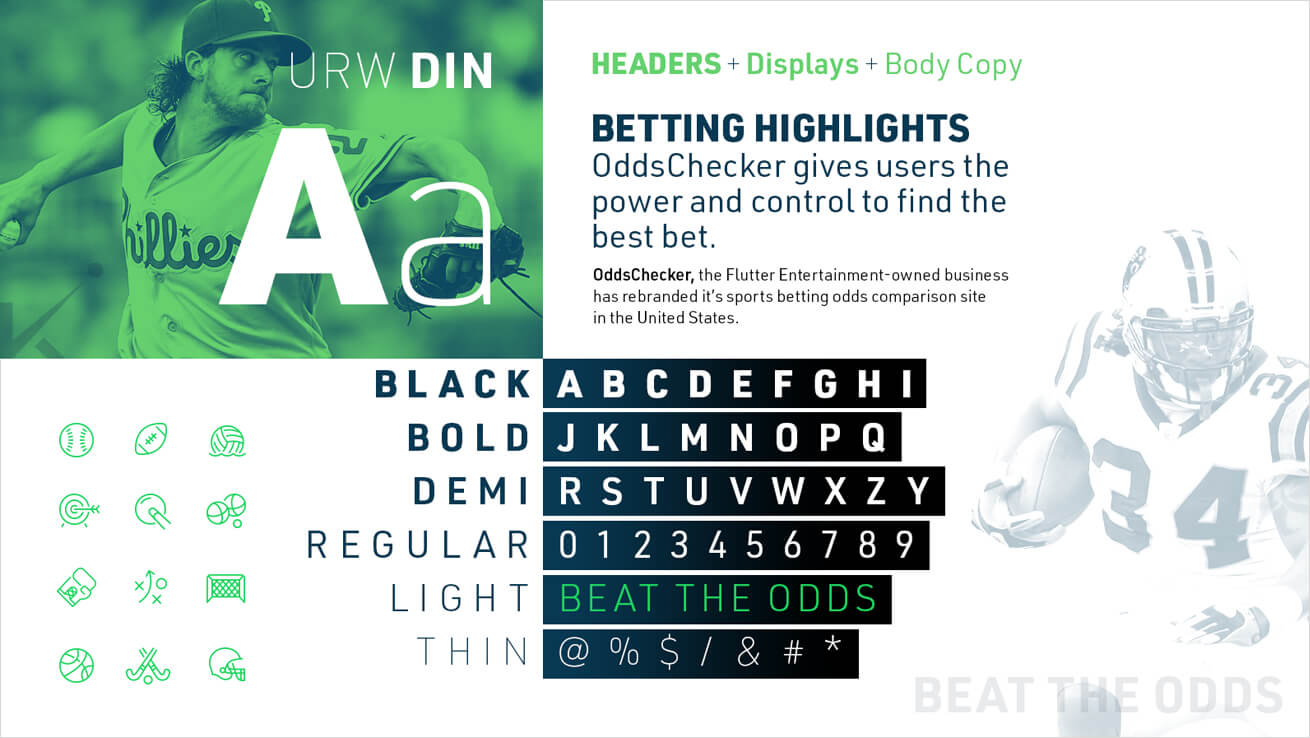
The rich blue and bright green primary color palette creates a contrast that is impactful, energetic and youthful-perfect for our core audience. Like the new logo, the primary typeface conveys a collegiate sports essence. The use of angled shapes picks up on the angle of the “K” check mark in the OddsChecker logo and reinforces energy, excitement and action.

Tagline
Xhilarate generated many taglines for consideration and research indicated that Beat the odds optimized the desired user experience. This tagline instills a sense of confidence and reinforces the emotional payout one feels by using a platform that presents the user with quantified odds comparisons.
