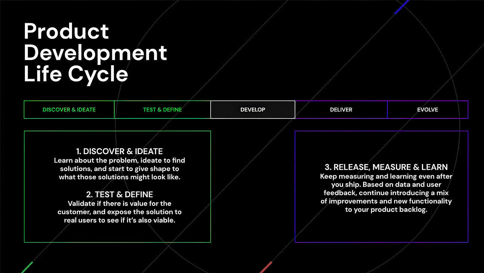
The first step toward improving your UX after launch is to set yourself up for success before you even go live. Track your experience, define your strategy, and set your metrics for success. Having KPIs established upfront means after your launch, you can determine what needs to be updated.

What needs to be improved?
Determining what needs to be updated or improved upon can seem like a wide net to cast, but there are only a couple of elements you need to consider. It’s a combination of:
+ How users are engaging with the product
+ The metrics of product KPIs and success in the business
All user testing will give you qualitative data, whether before the launch, in beta, or after your full rollout. Once users are sitting down with the real products, they can help you find new insights about how people actually use the product, and what the focus points are. You may learn new things — like users experiencing slow load times on different networks.
There are softwares (like Hotjar) you can use to create a heat map of activity on your product — the quantitative data of where people are spending the most time, and places that have created gaps in your intended flow.

Numbers and metrics are the other big part of this analysis. Collecting data isn’t very useful unless you’re putting into practice the updates your data is telling you that your users demand. Determining the funnel for your product can help you see where the gaps in that funnel are. Where do your users drop off? Is there something about their UX that is making it difficult or annoying to become a conversion point?
That end result doesn’t always have to be a transaction — it could be signing up for an email list or webinar — but knowing exactly what your intended funnel is can help you figure out how to make it flow better.
Methods for improvements
Numbers and metrics are the other big part of this analysis. Collecting data isn’t very useful unless you’re putting into practice the updates your data is telling you that your users demand. Determining the funnel for your product can help you see where the gaps in that funnel are. Where do your users drop off? Is there something about their UX that is making it difficult or annoying to become a conversion point?
That end result doesn’t always have to be a transaction — it could be signing up for an email list or webinar — but knowing exactly what your intended funnel is can help you figure out how to make it flow better.
It’s so important to add value every time you innovate, taking into consideration not only the user’s perspective and experience, but also the business at large. In an ideal scenario, those designing on the backend as well as your users will find the changes useful — or even essential.
Obviously, ROI is important for any product, new or old. Whether it’s growing revenue directly, or usership and goodwill toward your brand (resulting in a conversion to a sale later in the funnel), your product will be working to help people interact with your business. Features and improvements that are released in each updated version will target specific needs, or pain points, that you identified in your UX audit.
Analyzing metrics of when your users drop off, leaving the funnel, is a brilliant place to start in your audit process.
- You can also take a look at user flows that help you visualize the behavior of your users in a way that makes it easy to identify insights and how to reframe the product to mitigate those behaviors.
- Detailed wireframes and functional prototypes can also give you a good sense of the areas that will need improvement.
Since you know your product and your audience better than anyone, you’ll probably be able to anticipate some of the issues that might crop up as users navigate through.
By anticipating conclusions and getting ahead of the things you anticipate being a problem for your users, you can A/B test to create variants with structure and copy that will serve as quick fixes if you discover your premonitions are correct about where the issues lie. Following your hypotheses, you can map out quick fixes and long-term solutions alike.
How often should you reexamine your UX?

Reexamining and improving your UX should happen in three phases:
- Implementing intended changes and improvements from the original backlog plans
- Quick fixes in the moment
- Adapting every quarter based on metrics and behavior
You already have plans for improvement, but it’s important to remember to listen to your users and give them some of what they want, not just what you think they need. Especially if your heat mapping is showing you issues that can be quickly patched, using those metrics and feedback from users is essential.
Find a balance between advancing your product and applying some UX insights to improve what’s already in production. Looking at your product at least every three months or so will give you a longer period in which to analyze the behavior of your users, and you can tweak any future plans based on those numbers.


