Is the Nature of Color Objective or Subjective?
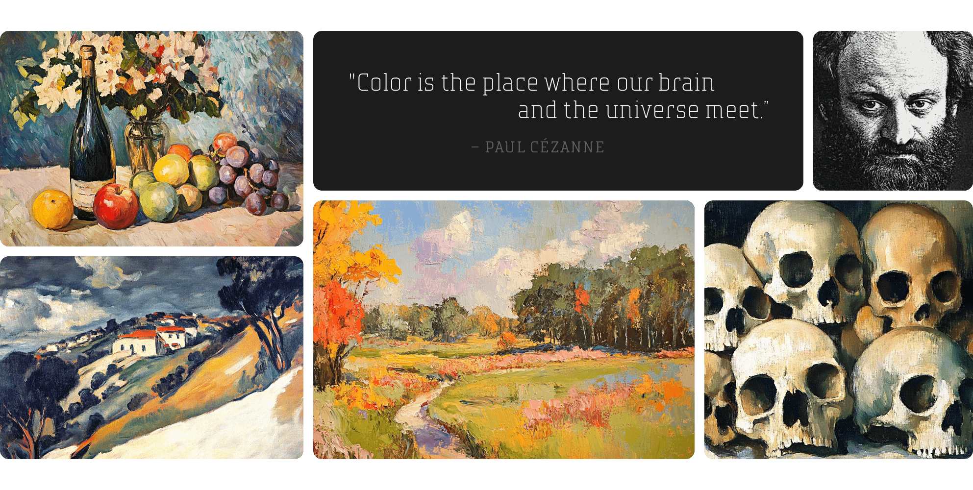
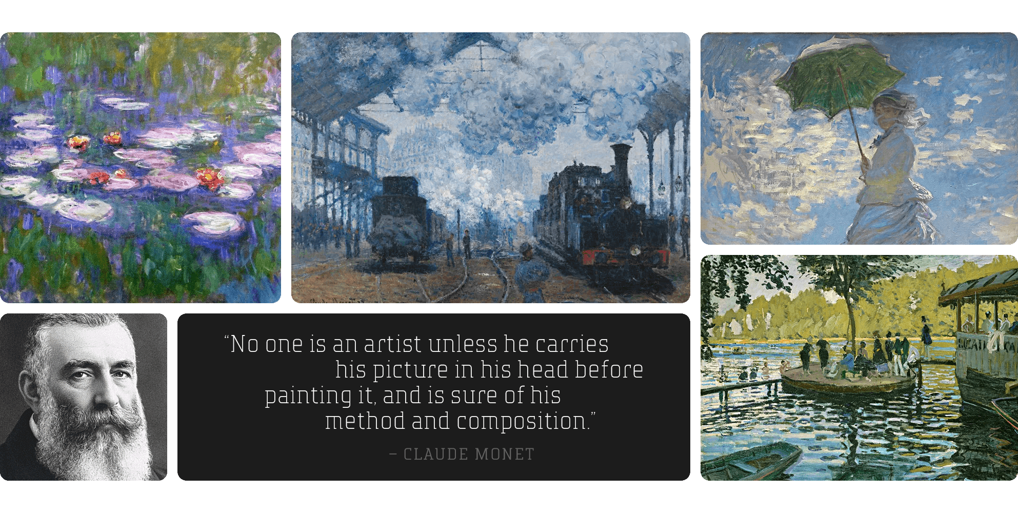
One of the most enduring debates in the philosophy of color is whether it exists as an objective reality or solely within human perception. Realists argue that color is an inherent property of objects, determined by how they absorb and reflect light. This idea is supported by Isaac Newton’s prism experiment, which demonstrated how white light refracts into distinct wavelengths, forming the visible spectrum. According to realists, color is as measurable and definite as shape or mass. However, subjectivists, including John Locke and contemporary cognitive scientists, propose that color is not a property of objects themselves but rather a mental construct shaped by our brains. The work of French Impressionist Claude Monet further complicates this debate—his paintings, particularly his series depicting changing light and atmosphere, suggest that color is not a fixed property but rather a shifting experience influenced by time, perspective, and environmental conditions. Monet’s ability to capture fleeting moments of color perception aligns with the subjectivist view that color exists as a product of human observation rather than an absolute truth. This raises profound questions: Do we see the world as it truly is, or is our experience of color shaped entirely by our cognitive and biological limitations?
The Psychology of Color and Its Influence on Emotion and Symbolism
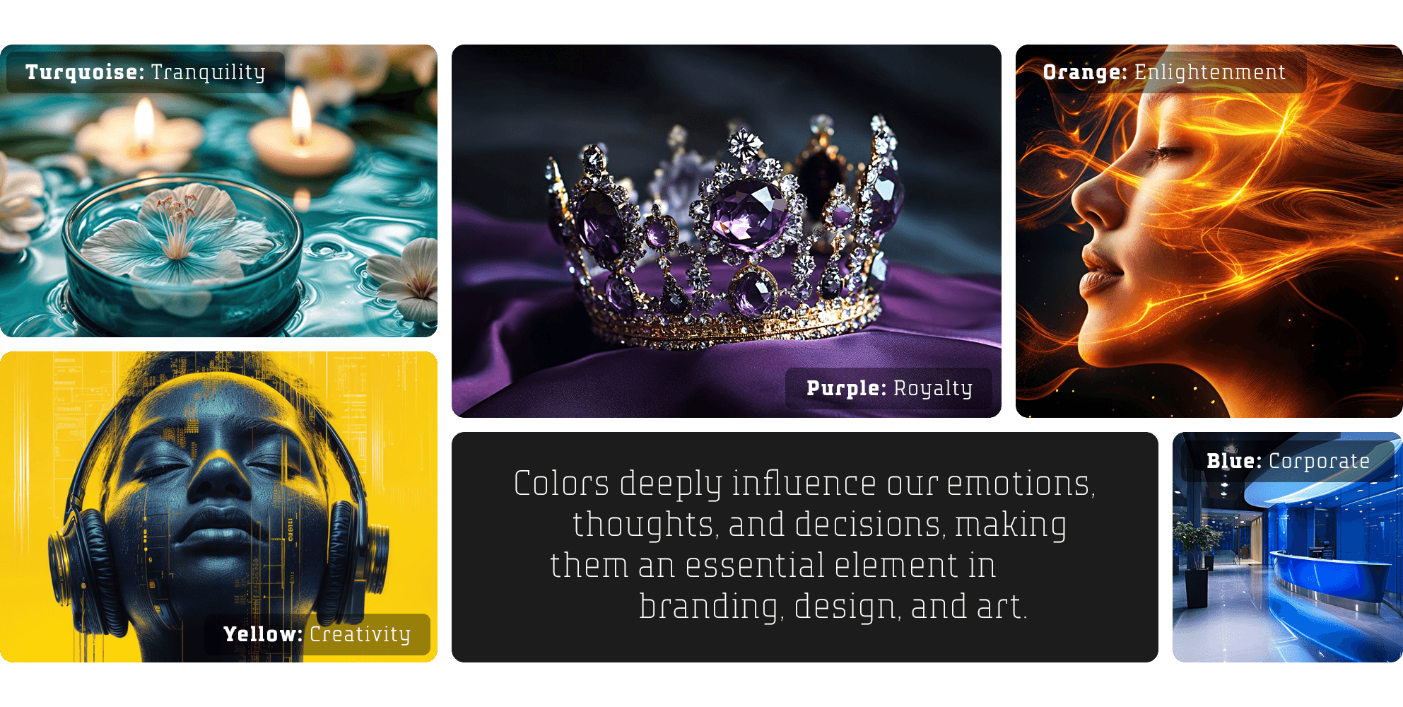
Color profoundly affects emotions, behaviors, and decision-making, extending beyond philosophy and science into branding, design, and art. Different hues evoke distinct psychological responses—red conveys passion and urgency, blue fosters trust and reliability, yellow inspires creativity but also signals caution, and green represents growth and harmony. Purple symbolizes luxury and wisdom, black exudes power and mystery, turquoise embodies clarity and healing, and white suggests purity and minimalism. However, cultural interpretations of color vary—white is associated with purity in the West but signifies mourning in many Eastern traditions. This complexity underscores color’s power in shaping perception across disciplines. Wassily Kandinsky, a pioneer of abstract art, believed color could directly communicate emotions, independent of form, likening its impact to the expressive nature of music. His work demonstrated how color alone could evoke deep emotional responses, reinforcing its significance in human experience. Whether in marketing, branding, or artistic expression, color is an essential tool for influencing perception, evoking emotions, and creating meaning across diverse cultural and psychological landscapes.
Colors deeply influence our emotions, thoughts, and decisions, making them an essential element in branding, design, and art. They evoke psychological responses that can shape our moods, alter perceptions, and even drive behavior. Warm colors like red and orange can create a sense of urgency or passion, while cool tones like blue and green promote calmness and trust. In branding, companies carefully select colors to communicate specific messages and establish identity. In art and design, color is used to convey meaning, evoke emotion, and create visual harmony. This powerful connection between color and human psychology makes it a crucial tool across disciplines.
- Yellow: Happiness, creativity, but also caution. Seen in warning signs and playful branding
- Orange: Energy, enlightenment, warmth, and playfulness. Used to evoke friendliness and adventure in marketing.
- Red: Passion, urgency, energy, and danger. Used in advertising to create excitement or alarm.
- Purple: Royalty, wisdom, spirituality, and luxury. Often linked to creativity and mysticism in branding.
- Blue: Calm, trust, intelligence, and melancholy. Frequently used in corporate branding for its reliability.
- Green: Growth, harmony, health, and nature. Associated with sustainability, wealth, and tranquility. Common in environmental branding.
- Turquoise: Clarity, healing, serenity, tranquility and communication. Seen in wellness, technology, and coastal aesthetics.
- Black: Power, mystery, luxury, and even mourning. Dominates high-end fashion and luxury branding.
- White: Purity, minimalism, emptiness, and potential. Used in modernist design and spiritual contexts.
Color psychology is not universal, though. Cultural differences shape the meanings—white symbolizes purity in the West but mourning in many Eastern cultures.
The Metaphysics and Science of Color
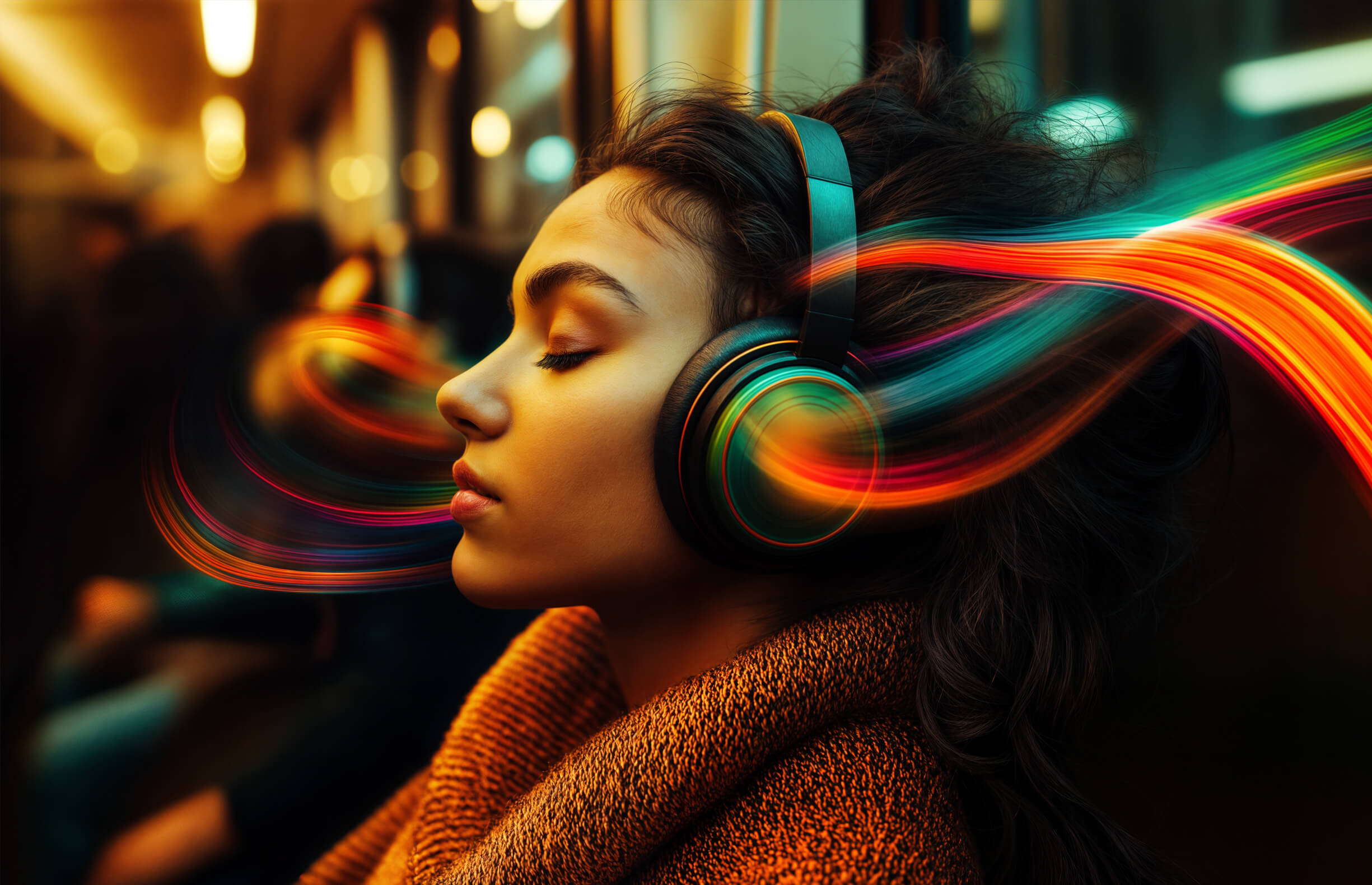
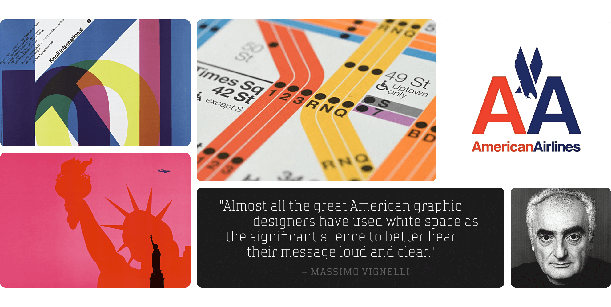
The question of whether color exists independently or is merely a construct of human perception has intrigued philosophers and scientists alike. Plato’s Theory of Forms suggests that color, like all sensory experiences, is an imperfect reflection of a higher reality, while Kant argued that color is not an external property but a framework imposed by human perception. Neuroscience supports this complexity, showing that color is processed through retinal cells that interpret wavelengths of light and send signals to the brain. Yet, perception remains subjective—two people may see the same object but experience its color differently, as illustrated by the inverted spectrum problem. Additionally, synesthesia, where individuals associate colors with sounds or numbers, highlights the deeply personal nature of color perception. Renowned designer Massimo Vignelli, known for his minimalist and structured approach, emphasized the functional and psychological power of color in design, advocating for its clarity and intentionality. His work underscores how color is not just a visual element but an essential tool in communication and user experience. While science measures wavelengths, the way we perceive and interpret color remains an evolving intersection of psychology, philosophy, and design, shaping everything from branding to artistic expression.
The Science of Color Explores Light, Perception, and Evolution
Neuroscience has shown that color perception begins with the retina’s cone cells detecting different wavelengths of light and transmitting signals to the brain. While this explains how we process color, it does not account for the subjective experience—two people may see the same object yet perceive its color differently. This raises questions about whether color is an inherent property of the world or merely a construct of the mind. The inverted spectrum problem highlights this uncertainty, suggesting that individuals might perceive colors in entirely different ways while using the same terminology, making it impossible to verify another person’s experience of color. Additionally, synesthesia, a phenomenon where some individuals associate colors with sounds, numbers, or emotions, further supports the idea that color perception is influenced by unique neurological wiring. Despite scientific advancements, the true nature of color remains an open question, bridging the fields of physics, neuroscience, and philosophy.