Color is more than just an aesthetic choice—it’s a critical branding tool that influences how consumers perceive and connect with your brand. From evoking emotional responses to conveying cultural meanings, color plays a powerful role in storytelling. This four-part series explores the psychology, cultural perspectives, emotional triggers, and even the mystical realm of Colorstrology, all aimed at helping brands harness the true power of color.
Discover how color shapes perception, emotion, and identity in branding. This four-part series unpacks the psychology, cultural depth, emotional impact, and cosmic insights of Colorstrology—empowering brands to unlock color’s full potential as a storytelling force.
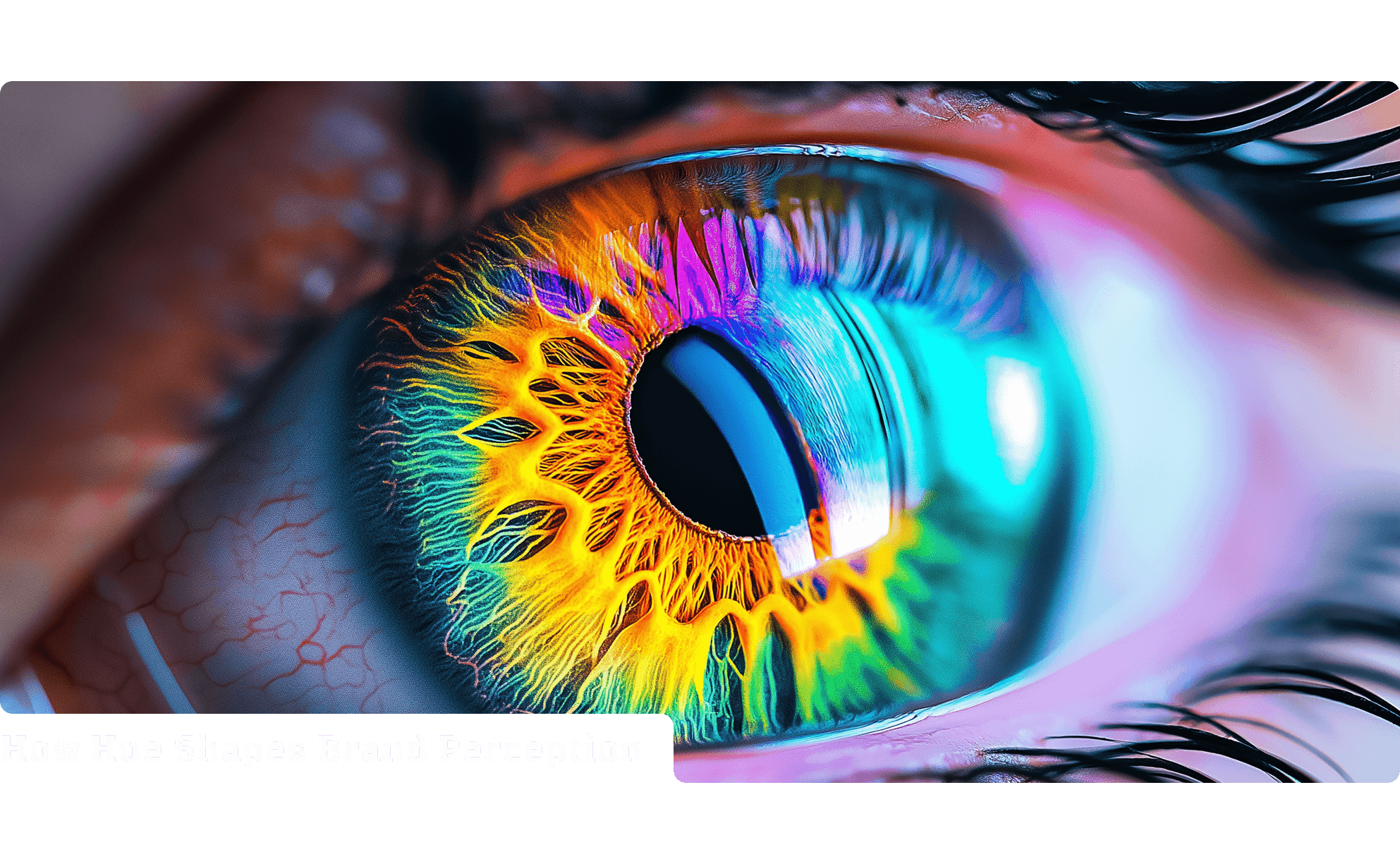
Color shapes how we see the world—and how the world experiences our brands. As a core element of branding, color goes far beyond visual appeal; it taps into the psychology of emotion and perception, influencing how people feel and behave. Different hues evoke different emotional responses—reds can signal energy and urgency, while blues suggest calm, trust, and reliability. Think of Coca-Cola’s iconic red, a deliberate choice to spark excitement and passion. In contrast, companies like IBM and PayPal rely on cool, steady blues to reinforce a sense of security and professionalism. These decisions aren’t arbitrary—they’re deeply strategic. Color becomes a silent yet powerful communicator, helping to shape consumer perception, build recognition, and foster emotional connection. Understanding the psychological triggers of color allows brands to craft more meaningful experiences and gain a competitive edge. In an oversaturated market, the right color choice can make your brand not just seen, but felt—and remembered.
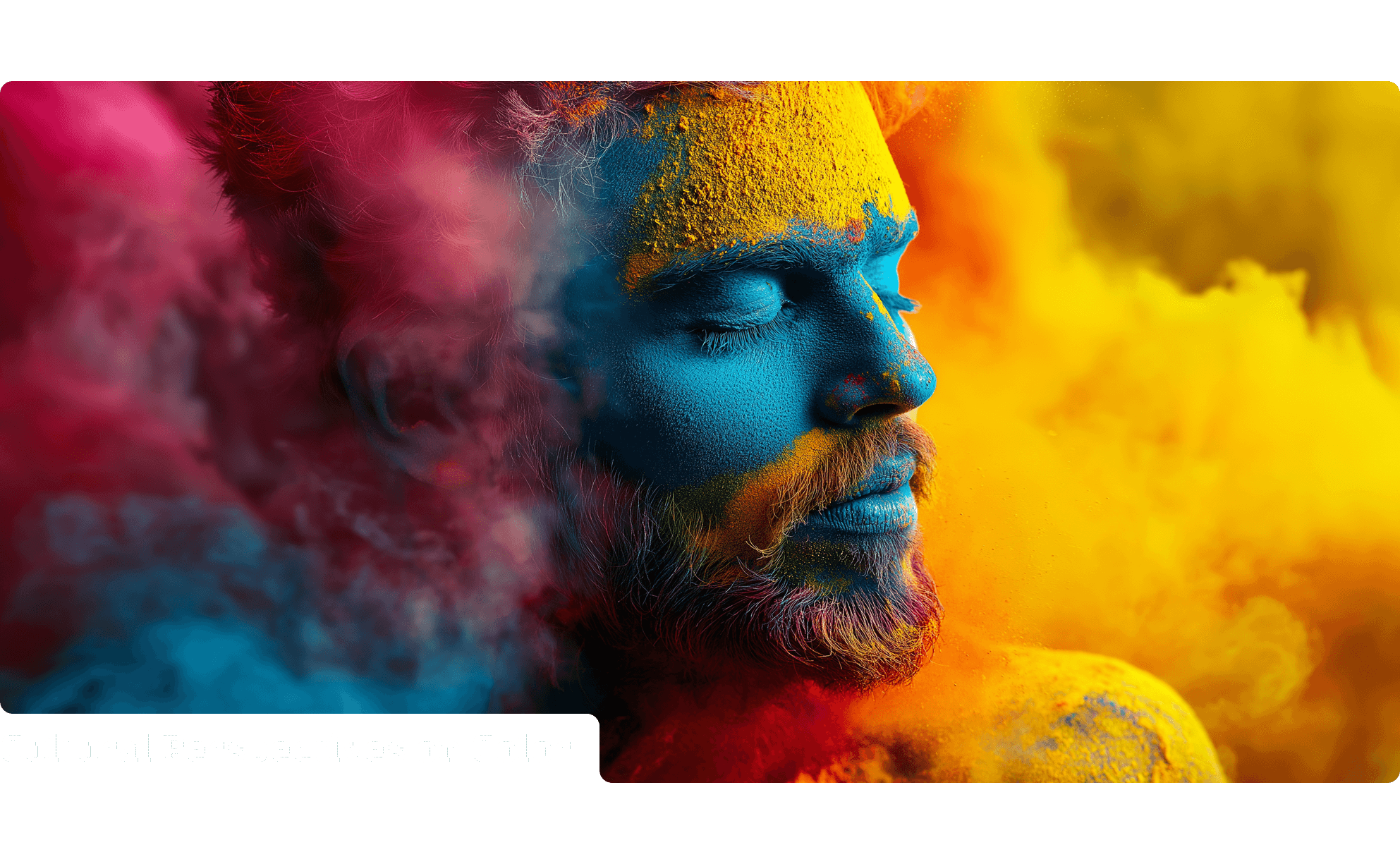
Color may be a universal visual language, but its meanings vary widely across cultures—and in branding, these cultural nuances can profoundly influence how your message is perceived. A color that communicates purity, elegance, or innovation in one part of the world might carry an entirely different—and potentially negative—association elsewhere. Take white, for instance: in many Western cultures, it symbolizes cleanliness, simplicity, and modernity, while in parts of Asia, it is traditionally linked to mourning and funerals. Similarly, red often signals urgency, danger, or passion in the West, yet in China and other East Asian cultures, it’s a symbol of luck, prosperity, and celebration. For global brands, overlooking these cultural connotations can lead to miscommunication, alienation, or even offense. That’s why cultural context is just as critical as psychological influence when selecting brand colors. Thoughtful, culturally informed color choices help brands resonate authentically across regions and build meaningful, inclusive connections with diverse audiences.
If you want to make a lasting impact, start with emotion—because that’s where color speaks the loudest. Research shows that people form subconscious judgments about a product within just 90 seconds of seeing it, and up to 90% of that initial impression is influenced by color alone. This means color isn’t just a design detail—it’s a powerful emotional shortcut. Brands in the financial sector often lean into blue to convey trust, security, and professionalism, while eco-conscious brands favor green to reflect growth, health, and harmony with nature. These emotionally resonant color choices help amplify a brand’s message, making it more memorable, relatable, and persuasive. However, the wrong color can be just as influential—confusing your audience, misrepresenting your values, or even eroding trust. That’s why understanding the emotional triggers behind color is not just smart branding—it’s essential. When aligned with your brand’s personality, color becomes an unspoken emotional connector that drives loyalty and recognition.
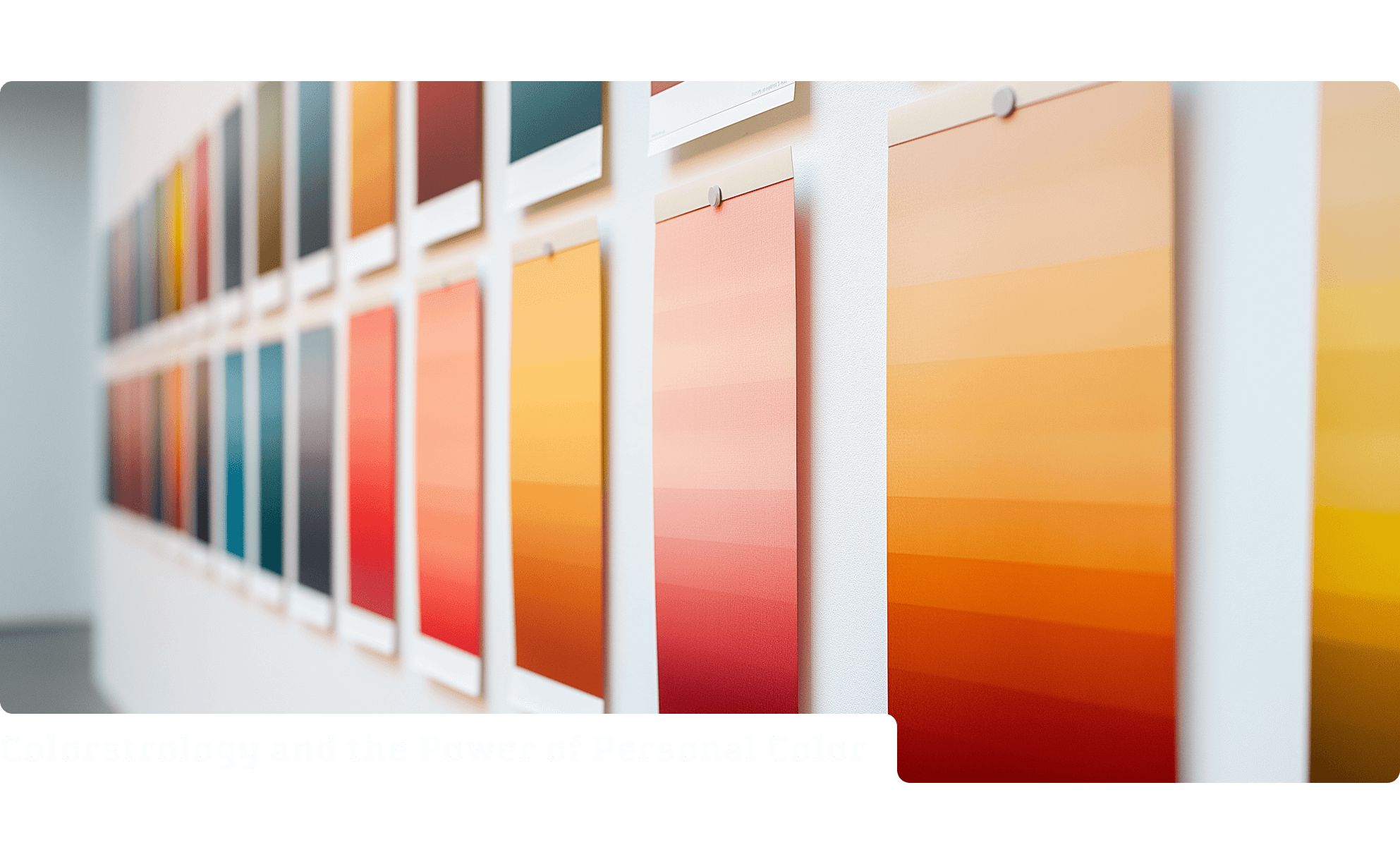
Color’s influence stretches beyond psychology and cultural symbolism—it also has a deeply personal dimension rooted in astrology and numerology. This connection comes to life through Colorstrology, a system developed by astrologer Michele Bernhardt in her book Colorstrology: What Your Birthday Color Says About You. According to Bernhardt, every day of the year corresponds to a specific color that embodies the traits, strengths, and emotional essence of those born on that date. These personalized hues go beyond aesthetic preference—they’re believed to influence mood, creativity, energy, and even decision-making. From the bold Aries Red to the tranquil Pisces Seafoam, Colorstrology offers a captivating, introspective lens through which individuals can explore their inner selves. For brands, tapping into this personalized color experience presents an opportunity to connect with audiences on a deeper, more intimate level. Whether used for inspiration or integrated into brand storytelling, Colorstrology adds a mystical, emotional layer to how we understand and engage with color.
