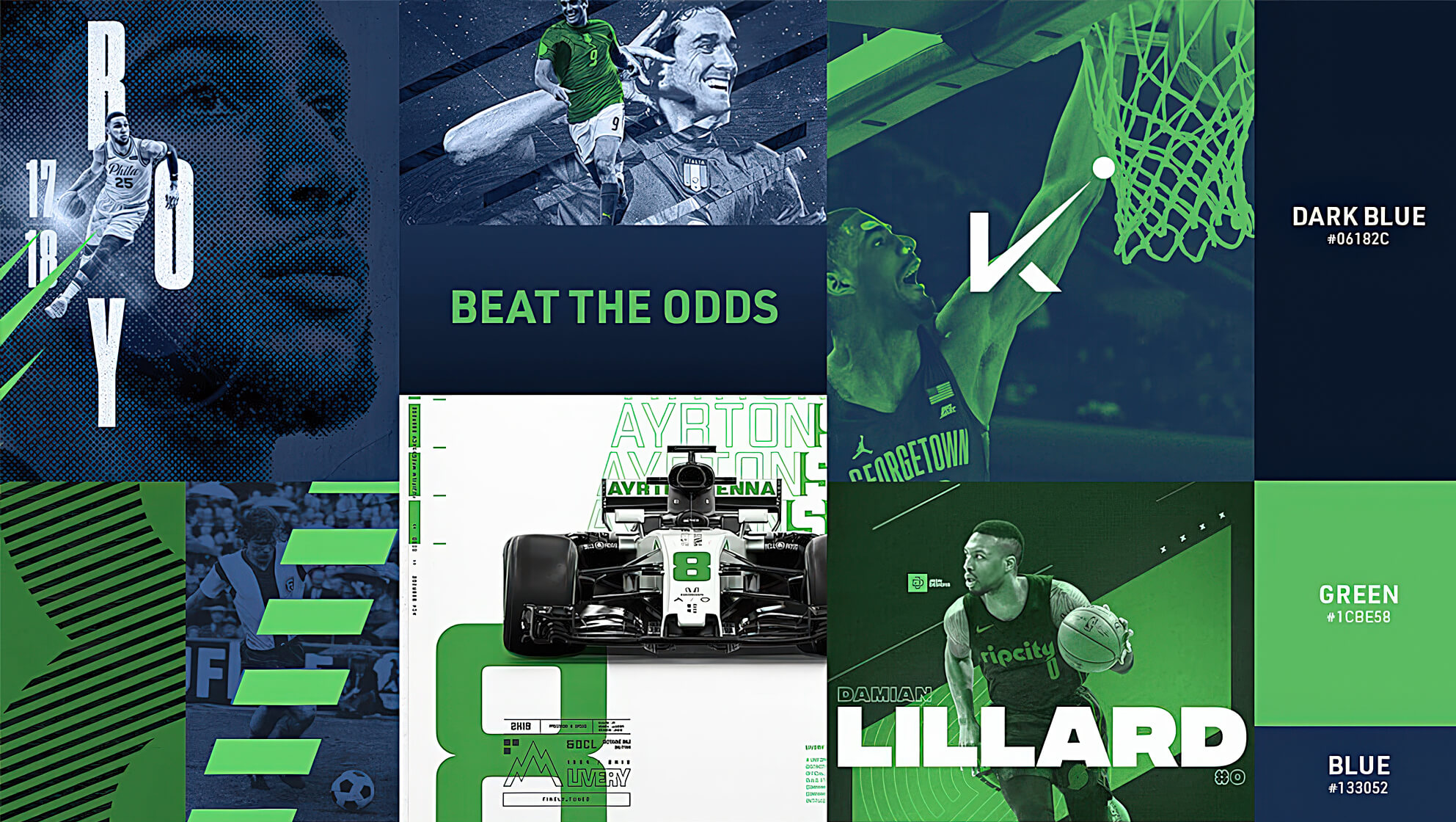
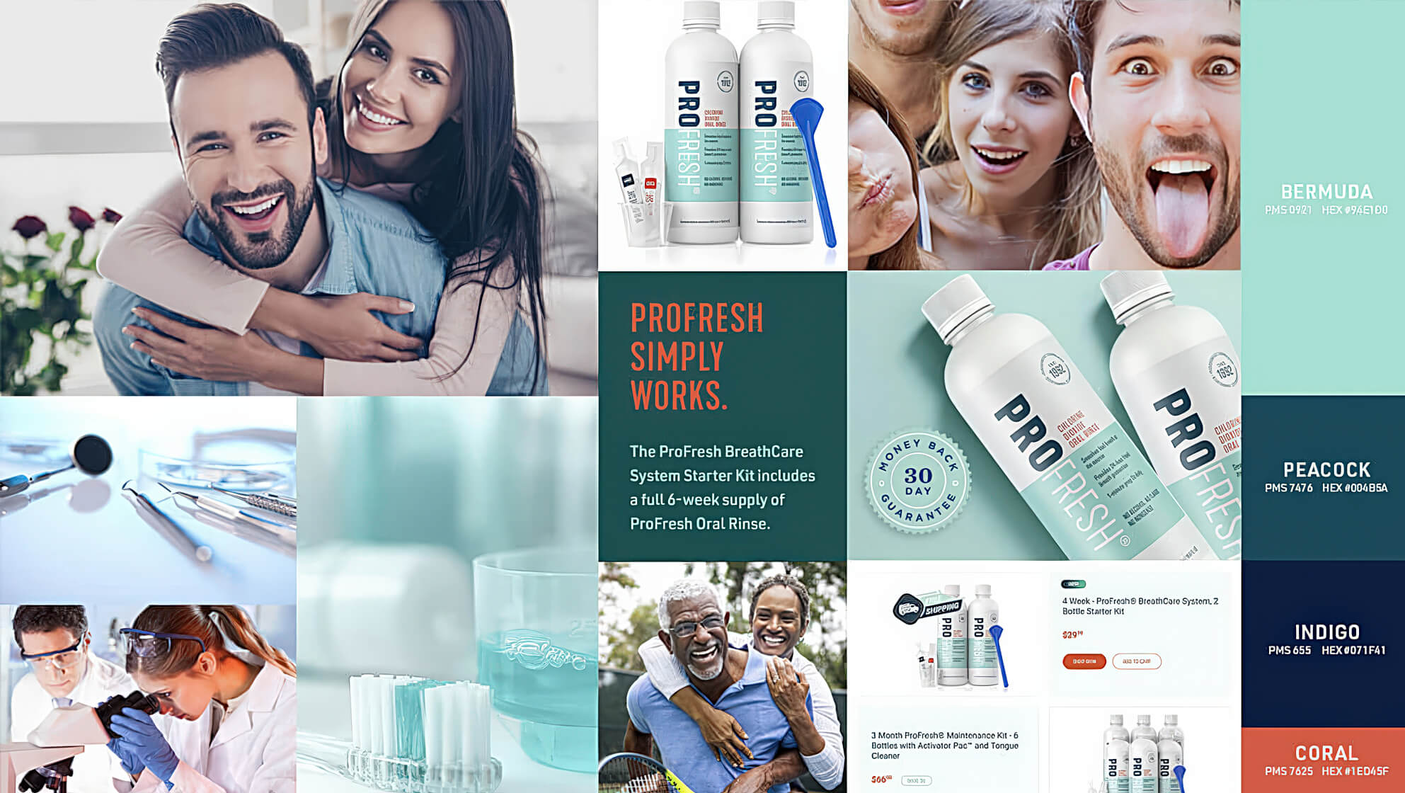
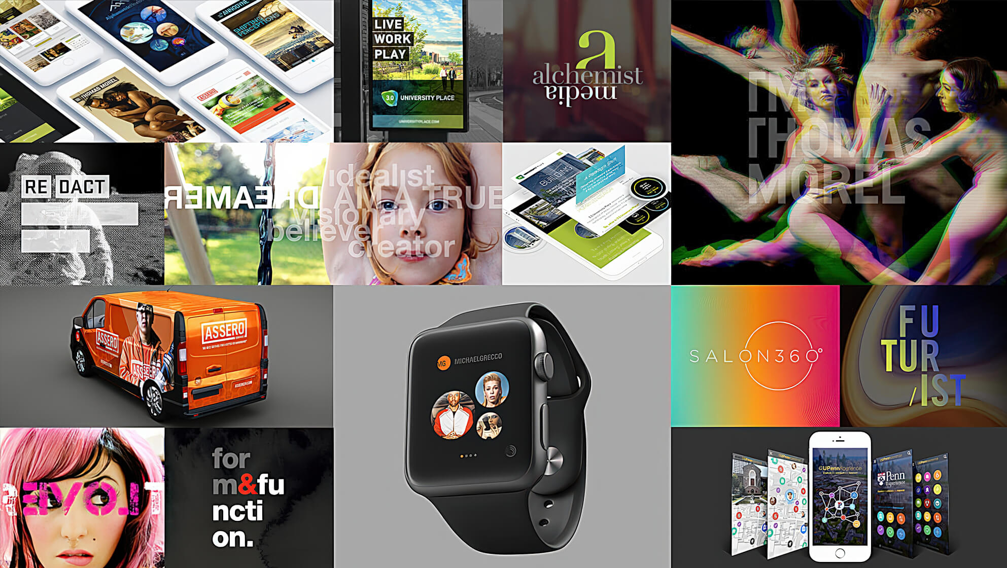
A stylescape is a visual representation of a brand, showcasing colour schemes, typography, images, and how the content will be laid out. They are the perfect way to present a tangible, visual representation of your client’s brand, ensuring that you’re both heading in the same direction as you enter the design stage of the process.
Why Not Use A Moodboard?
Moodboards tend to be a collection of inspirational images, whereas a stylescape takes the images from our moodboards and alters them to fit the brand’s proposed identity. They are often long and rectangular, providing an overview of the brand’s new image. It’s a great way of presenting the final product without actually creating anything new.

The Brief.
The first stage is to understand your client’s brand as much as possible. Discuss their vision with them, and from there you’ll be able to begin building your stylescapes. Start by looking at their brand attributes – figure out how they want to be viewed by their audience. This is a great opportunity to identify a few keywords they want their brand to be associated with.
Once you know how the stakeholders want the brand to be perceived, you can turn your attention to their customers. Creating two or three personas allows you to tailor your client’s brand image towards their desired audience. Once they’re happy with both the customer personas and the brand attributes, you’re ready to start creating.
Creating Stylescapes.
When it comes to actually building your stylescapes, imagine it as a visual journey. It’s best to start with the basics – typography and colour scheme. Using the keywords associated with your client’s brand and customers, you can look into the best colours and fonts to match with their desired image. For example, if a client defined their brand as ‘approachable’, you may want to use a warmer colour scheme to convey that.
Similarly, the images you select should fit with the style you’ve begun to build. Again, the keywords will be very useful here, as you can use them to find the most relevant graphics for your stylescape. With all of those details fine-tuned, you can create another section that reflects how the content would ultimately be laid out. The finished stylescapes should provide your client with a solid overview of their brand, and a good idea of the final product.

Presenting Your Stylescapes.
Ideally, you want to present three or four stylescapes to your client, each focussing on a different keyword or idea. This saves you the trouble of repeatedly returning to the drawing board, as your client has a variety of options before them. Rather than having them select one of the stylescapes, ask your client how they feel about the individual elements of each one. What do they like? What don’t they like? Perhaps they want the fonts of one, but the colour scheme of another. With this information, you can create a final stylescape that captures all of their favorite elements.

The Final Stylescape.
With your newly collected feedback, you and your client should be on the same page going forwards. This means that this next stylescape may be your last – but keep in mind that further tweaks may be needed. Nevertheless, it should shorten the entire process. Once this is approved, you can get to work on the concrete mockup, confident that you’ve captured your client’s desired image.

Conclusion.
Creating stylescapes allows you to stay on the same path as your client, keeping them involved in the whole design process. It can save a lot of time that’s often wasted going back-and-forth with new ideas, as well as saving you from making a final mock-up without a clear green light from the client.


