RENAISSANCE

TRANSFORMING THE IDENTITY OF A WELL ESTABLISHED AND RESPECTED PHARMACEUTICAL CDMO

OVERVIEW

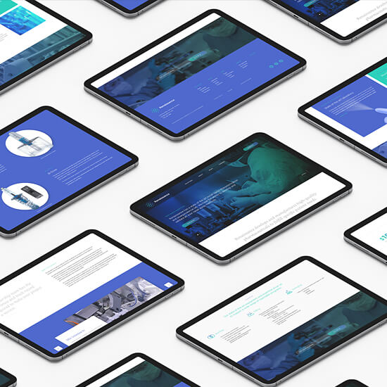
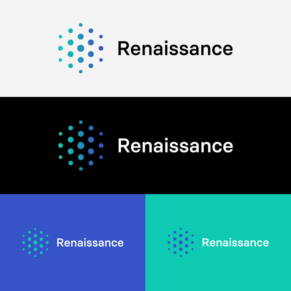
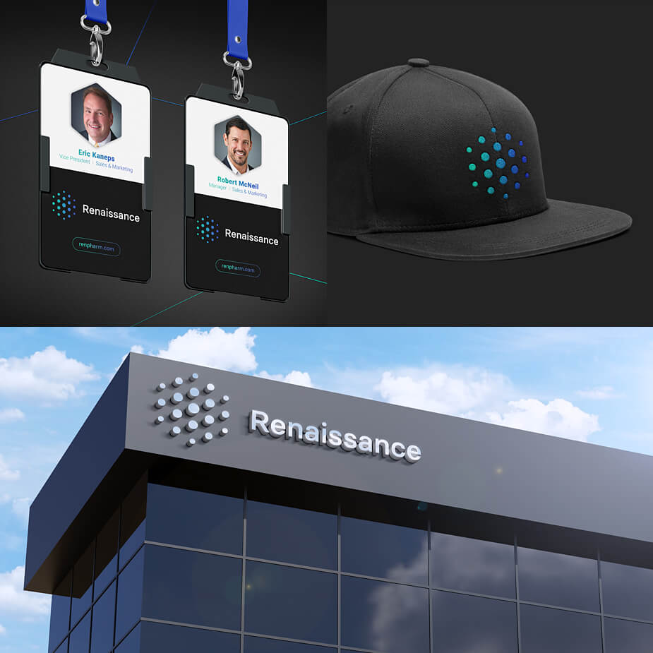
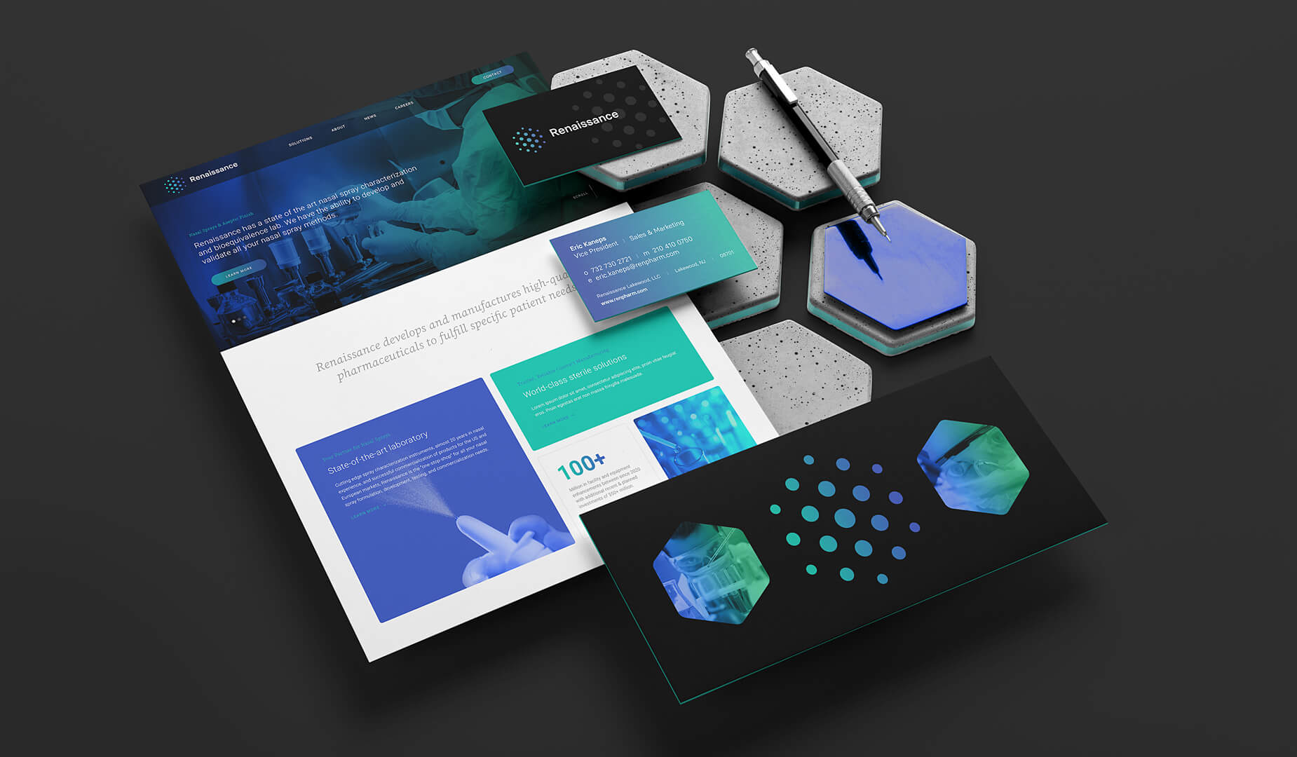
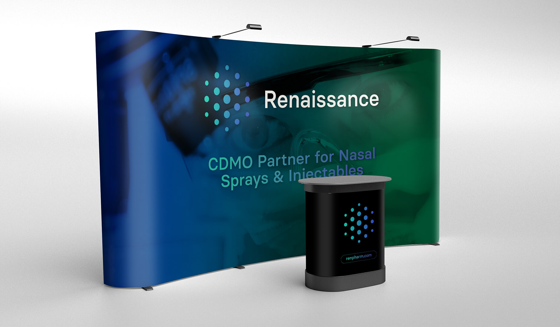
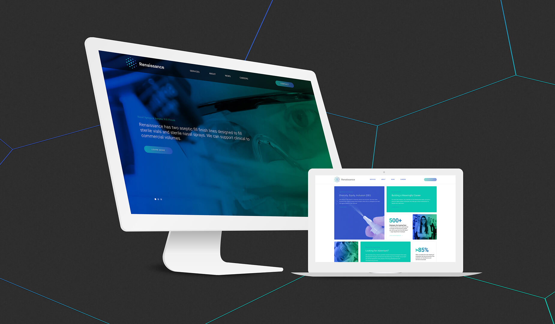
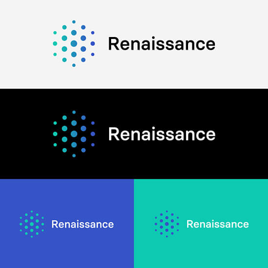
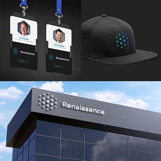
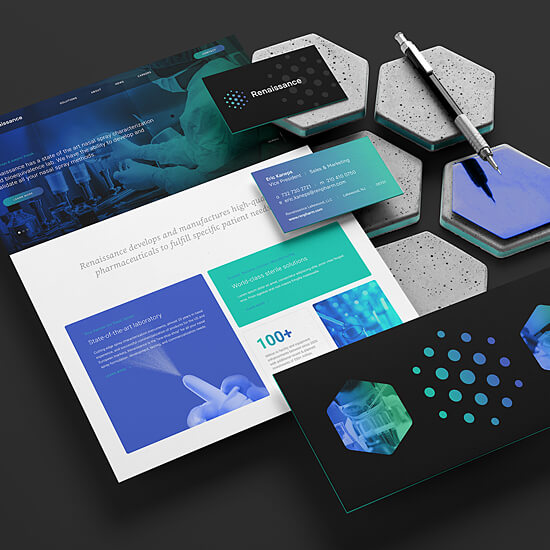
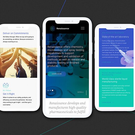
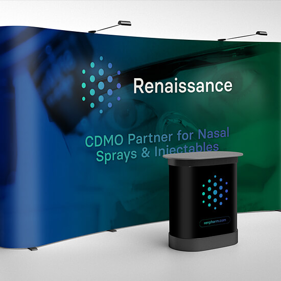
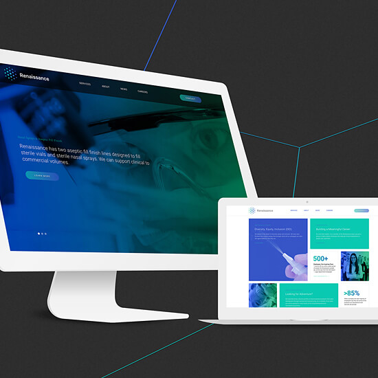
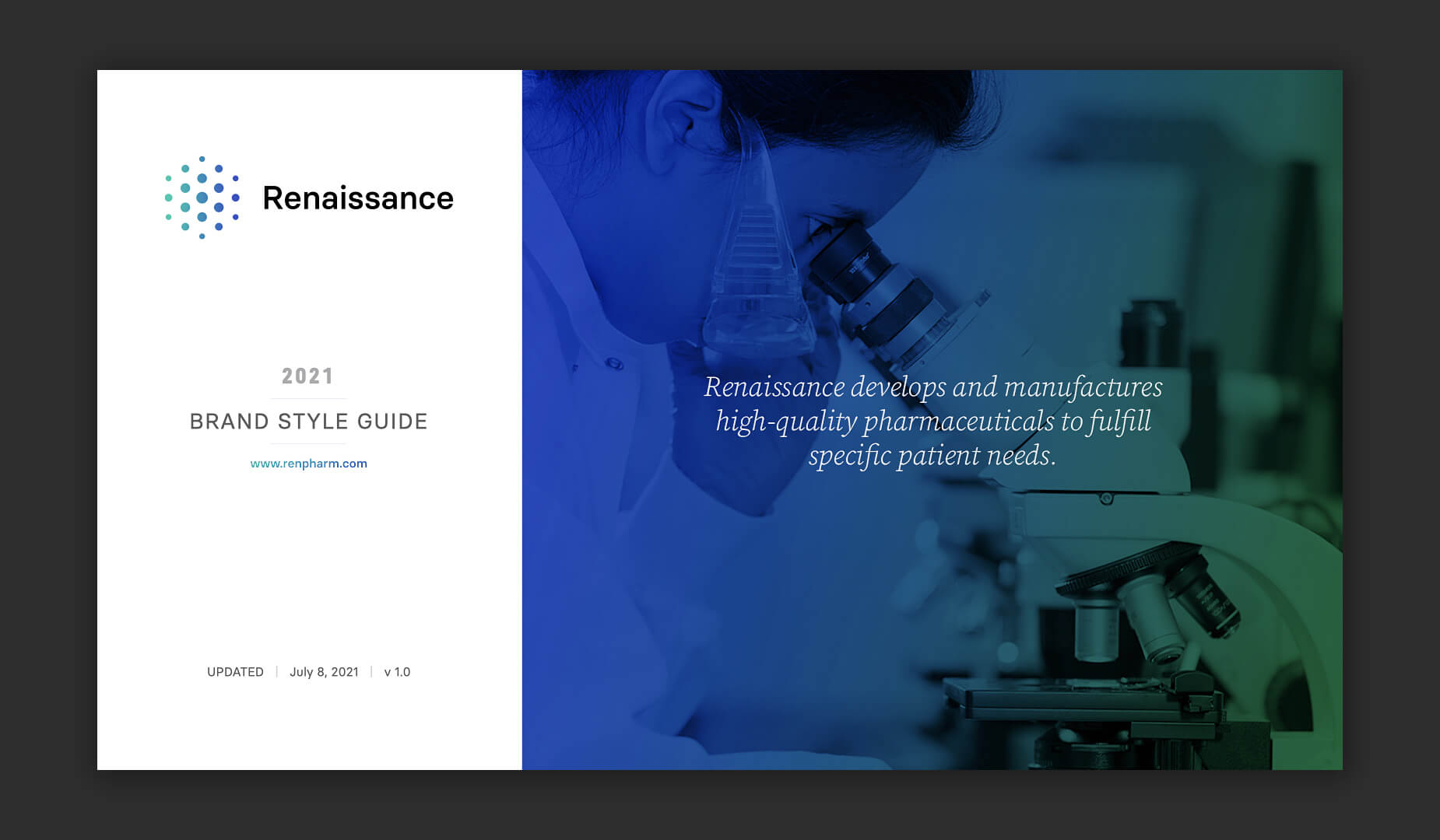
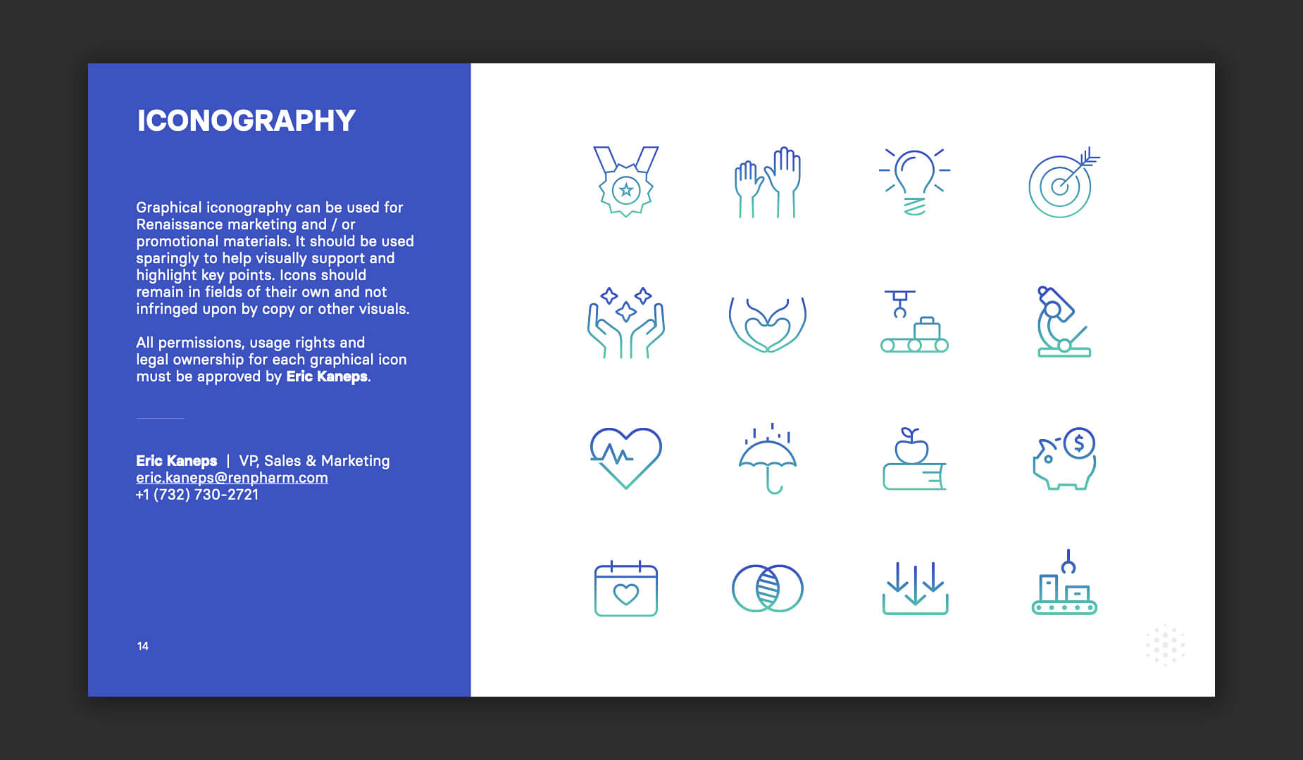
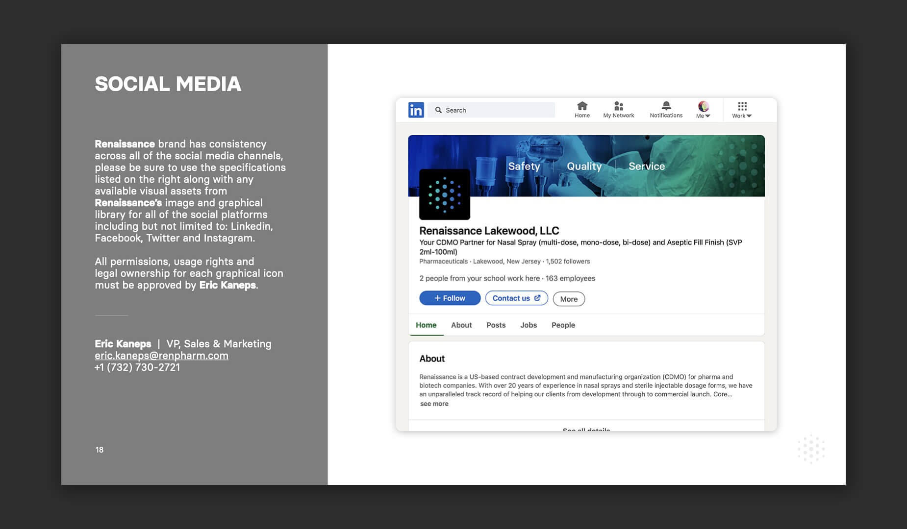
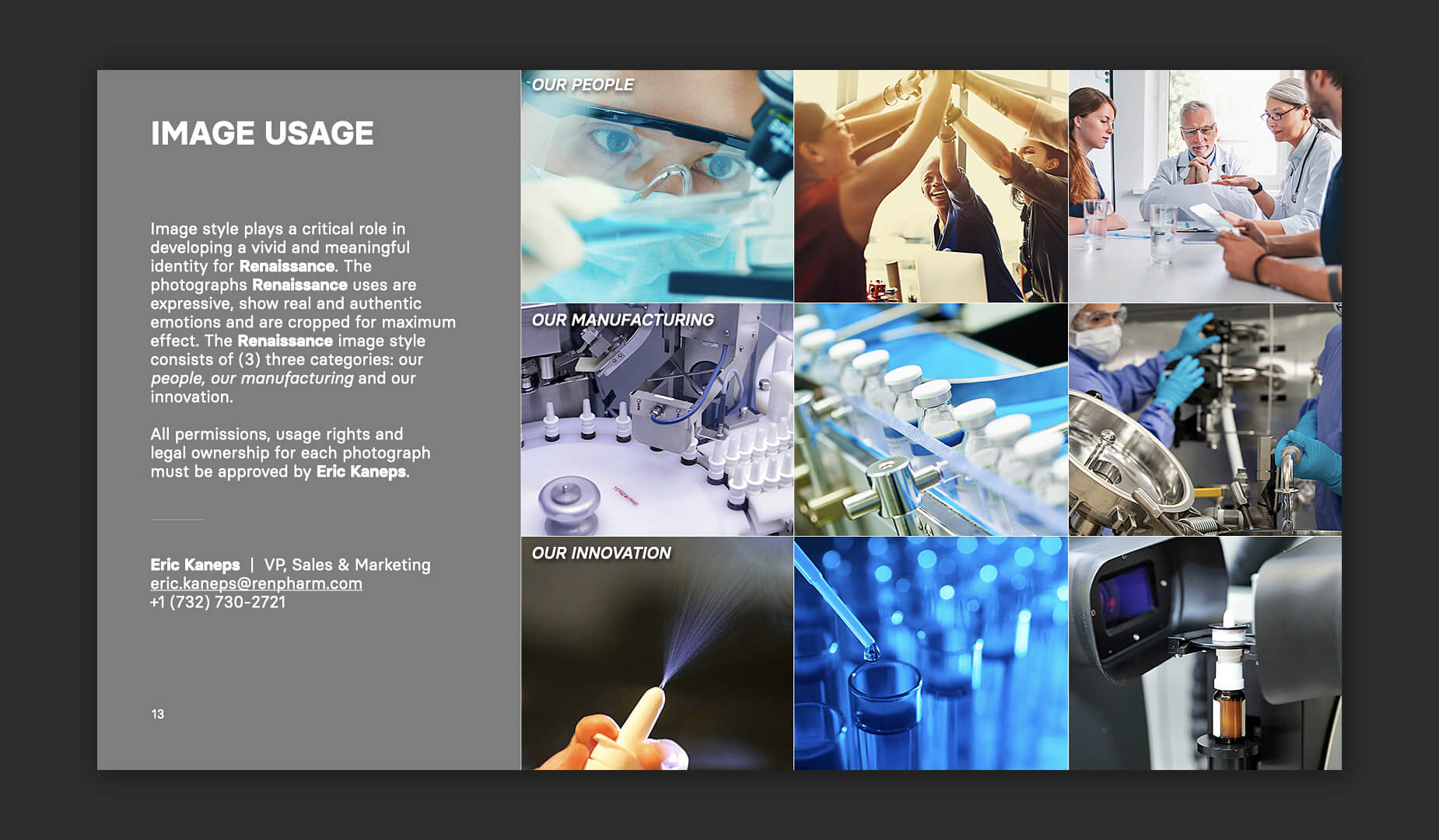
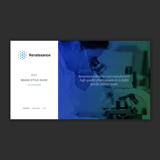
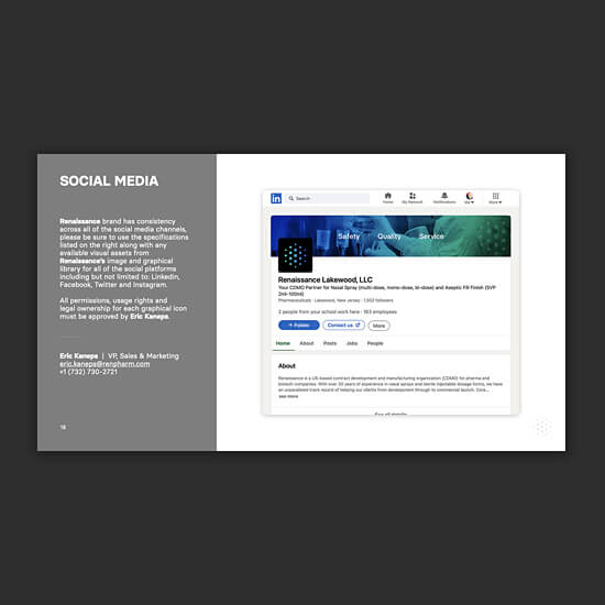
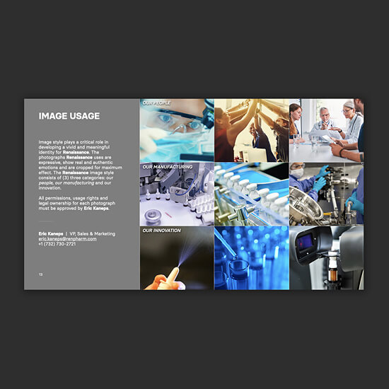
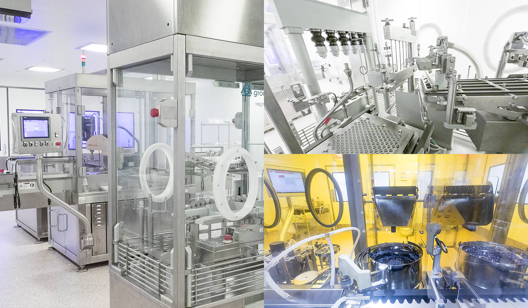
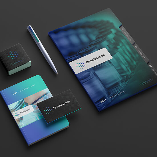
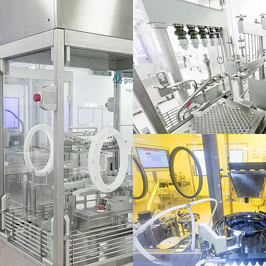
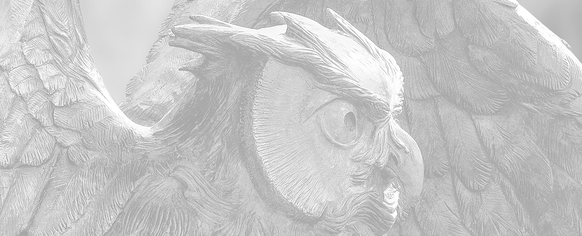
Renaissance Lakewood, LLC is a US-based contract development and manufacturing organization (CDMO) with over 20 years of experience in the development and manufacturing of nasal sprays and sterile injectable dosage forms for pharmaceutical and biotech companies. The Renaissance brand was looking staid: it was no longer in alignment with the firm's leadership position and was not reflective of its core values - innovative, knowledgeable, resourceful and confident. The new look and feel features a color palette that balances optimism with trust and confidence. The typography, imagery and messaging work in harmony to position the company as an innovative leader backed by science and technology. The new dot-pattern logo pays homage to Renaissance's nasal heritage and forms a 3-dimensional cube to signify how the resources of the organization unite to form a strong, confident and unified entity.

CLIENT
Renaissance Pharmaceuticals Lakewood, LLC
SERVICES
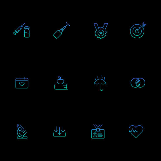
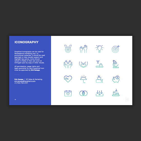
Logo Identity, Brand Style Guide, Look & Feel, Art Direction, Iconography, UI/UX/IXD, Website Design, C-Suite Materials, Copywriting, Advertising, Social Media Cards, Promotional Items, Trade Show Display, Photography, Video Production, Signage, PPT Templates, Content Creation, Image Library
PARTNERS
Markations
Zave Smith Photography
1440 Film Company

ENGAGE

Whether an existing or new client, one is immediately drawn to the Renaissance brand when visiting the new website. From the impact of the logo, which speaks to innovation and collaboration, to the optimistic cobalt and sea-foam color palette and to the dynamic, interchangeable content grid that supports a range of content including capabilities, services, factoids and a historic timeline one engages with the brand on a multitude of visual levels. Imagery, animations and videos pique curiosity and maintain customer interest from page to page.

EXCITE

We combined the brand’s cobalt and sea-foam primary colors to form a gradation to convey optimism, progression and excitement. This technique is used throughout various touchpoints to help bring dimension to both the website and printed page. Imagery and messaging were carefully crafted to reinforce credibility, knowledge and expertise.

INSPIRE

The overall transformation of this brand from where it was to where it is today is very inspiring, especially for those team members and customers who have experienced the brand first-hand. The brand’s new look and feel, imagery and messaging bring it into the 21st century and help set the expectation that Renaissance is driven by innovation to continually deliver unique solutions.

“Xhilarate transformed our brand from something that was stale into a brand that is better aligned with our innovative technology and ability to provide our customers with unique solutions in the CDMO space. They approached our new brand holistically by not only designing for our website, but also taking into account applications across all touchpoints.”
ERIC KANEPS / VICE PRESIDENT OF SALES & MARKETING - RENAISSANCE

LET’S START A PROJECT

Have a project or a napkin sketch idea? We'd love to talk with you and see if we're a good fit. Let's build something great together!