It’s become a nasty tradition to resort to the pandemic and its global “heritage” whenever we speak of new trends and important events in science, culture, or art. That’s why the choice of Pantone color of the year 2022 is particularly important for us today: as it feels like the first big step towards the better days and emphasizes another hugest value of humanity: creativity.
Last year Pantone announced two colors instead of one, and it was probably the best solution to describe the times we all came through in 2020 and what we should have kept in our hearts for 2021. Ultimate gray transferred the feelings of composure, steadiness, and resilience, while the illuminating yellow color was supposed to bring positive associations.
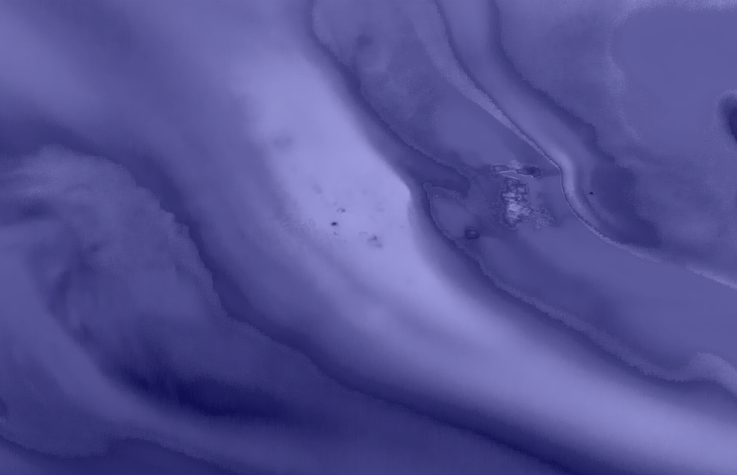
For 2022 Pantone Color Institute selected PANTONE 17-3938 Very Peri, the saturated lavender hue as a symbol of the global zeitgeist of the moment and the transition the world is going through, and the role of graphic design in it. Our lives undergo massive changes; standards and goals evolve, and even the understanding of work, social and personal life gets re-shaped. In these times of great transformations, graphic and digital design, gaming industry, and other digital fields help stretch the limits of reality as they set up a dynamic virtual world full of possibilities and creative realization.
As we move into a world of unprecedented change, the selection of PANTONE 17-3938 Very Peri brings a novel perspective and vision of the trusted and beloved blue color family, encompassing the qualities of the blues, yet at the same time with its violet red undertone PANTONE 17-3938 Very Peri displays a spritely, joyous attitude and dynamic presence that encourages courageous creativity and imaginative expressions.
— Leatrice Eiseman, Vice President of the Pantone Color Institute
It’s not the first time when Pantone color of the year belongs to the blue family. Two years ago, they already announced Classic Blue as the color of 2020. Meant to stand for serenity and faith in our future, the color actually failed meeting the global spirit, as the rising pandemic undid its good intentions.
It’s not the first time when Pantone seeks the symbol of creativity in color either. In 2018 they chose Ultra Violet, made to celebrate ingenuity and imagination. It’s interesting that we came up with similar spirits and hues in 2022, and it frankly gives tangible hopes for significant transformations in the future.
The Pantone Color of the Year reflects what is taking place in our global culture, expressing what people are looking for that color can hope to answer.
— Leatrice Eiseman


