There’s hardly a creative person casting doubts on the benefits of social media. It’s okay to build up a personal brand only having an account on Instagram and carry a message across the world without leaving a room. However, it looks like for creative people to build a strong social media presence is way trickier.
Why does it work this way? It’s assumed that once a creative project creates their Instagram, Facebook, Twitter, or Youtube page, comes a flow of subscribers and followers, and their audience grows intensively. But in practice, it’s only a few people.
To become a blogger is surprisingly easier than positioning and promoting businesses on social media. The difficulty is that you have to find your best-matching platform, your style, your audience, and keep the balance between self-positioning and generating useful & beautiful content.
What’s the Best Social Media for Creative Businesses?
To answer this question, you should ask yourself: “What do I do best? What is my brand like?” If you are a great storyteller, you’re likely to find your reader in Facebook or Twitter. If you bet on inspiring graphics, why don’t you try Pinterest? If you can make reviews and tutorials, you’ve got your audience on Youtube (just make sure to create a stunning intro video) , and if you are willing to build your digital presence via texts, awesome, graphics and strong personality (and you’re aware of it), Instagram is the right place.
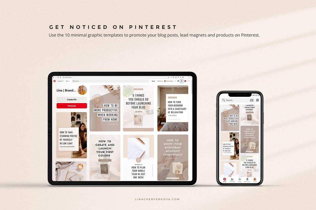
So, there is no one answer for all. Knowing your brand, its values, philosophy, branding guidelines is a way to pick the relevant social media channel. There is no need to try to be everything everywhere — it’s better to be less and in the right place.
Know Your Competitors
Frankly, there are no competitors in social media. However, you still should be aware of how other creators establish their social presence. Everything matters: how they address to the audience, what imagery they pick, what they share in their stories and even which hashtags they use. This way, you’ll have to assess your own creative powers, compare them with the trend-setters of social media, and finally carry out something that would be you.
Graphics Made to Kill
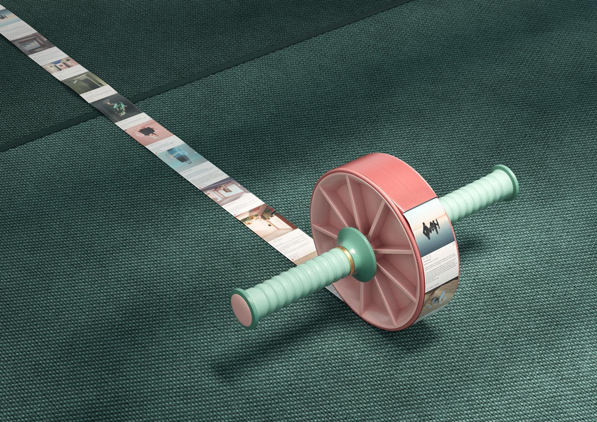
For most users, imagery is the primary source of information. So depending on your social media strategies, you may be working hard on texts or not, but your shots must be flawless. There are millions of guides on how a blogger should deliver the imagery, which we can sum up to a few focal points:
- Size of the image: the optimal Instagram image size is 1080×1080 px, Pinterest image size comes from the average 2:3 ratio.
- Uniform style: use the same or matching filters for all images of your page.
- Composition: mind the golden ratio.
- Mockups: if you’re a product creator and make logos, fonts, or any graphic resources, don’t overuse mockups. They make your profile look unnatural. Instead of 10 cookie-cutter images, make 2 high-quality preview images.
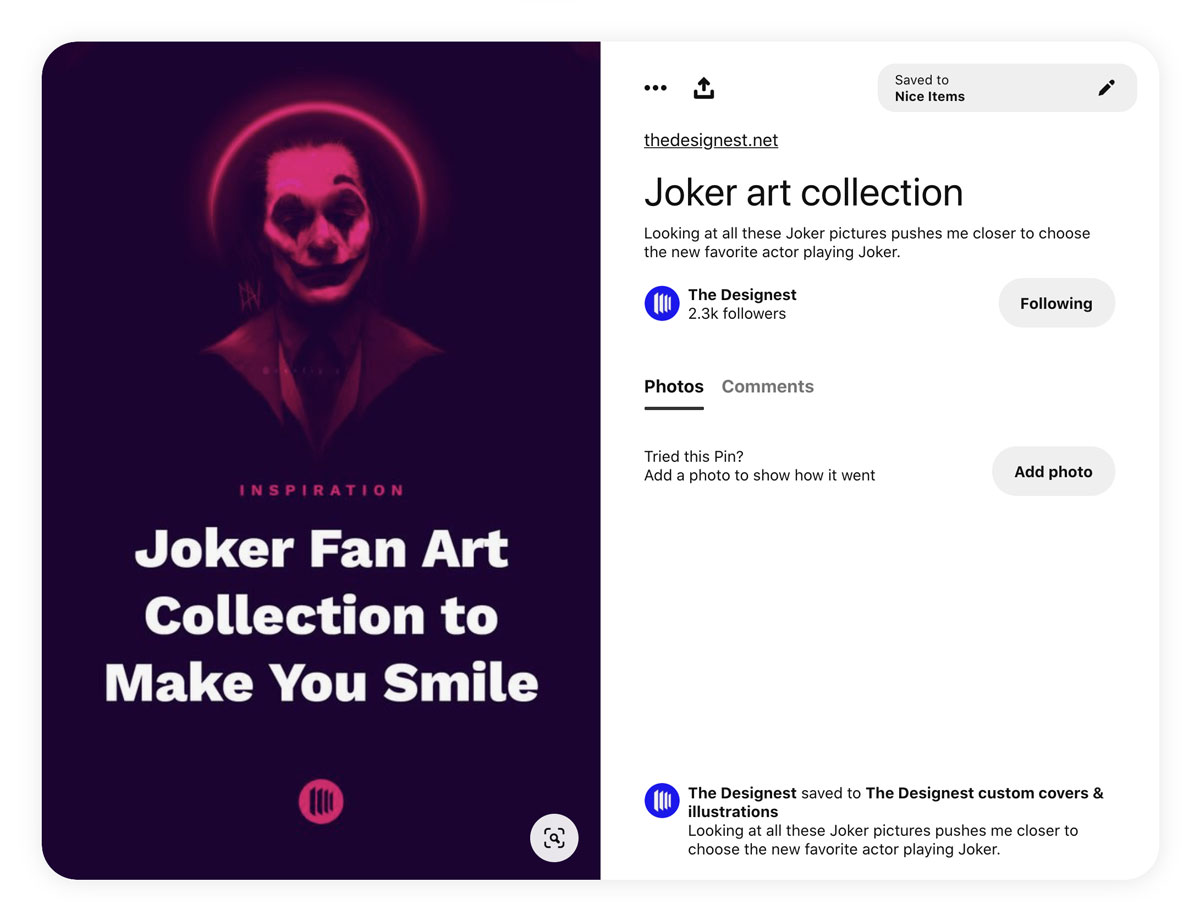
Eventually, you build up your social media presence for humans, not for lifeless engines. So it will be good to ask yourself from time to time whether you would put a like on a post like that or rather scroll by.

