If you haven’t done so yet, work through this exercise to come up with your brand identity and business name.
Once you’ve figured out your brand identity, you have to create a visual identity — also referred to as brand imagery — to go along with it.
While you could easily throw together visual elements that speak to you, your goal should be to choose visuals that resonate with your audience. So, building your visual identity is going to require some work.
In the following post, we’re going to look at how your brand’s visual style can give off certain signals to those who encounter it (and how to use those to your advantage). We’ll also break down what you need, to piece together your visual identity.
The Power of Visual Identity
Each of the design choices you make that website visitors, social media followers, and customers can see will impact how they approach your brand. Are you a fun-loving company that caters to a younger crowd? Do you create high-tech products that solve serious global problems? Are you a successful entrepreneur who’s reshaping the way we talk to one another?
When done right, our brand visuals convey our brand’s personality, values, and mission without having to use any words.
Think about your favorite clothing brand. What do you picture? Let’s use Athleta as an example.


The logo is probably the first visual element that comes to my mind:
The grey radial shape is one I’m very familiar with. It’s on their website, their social media, and it’s usually imprinted somewhere on their clothing.
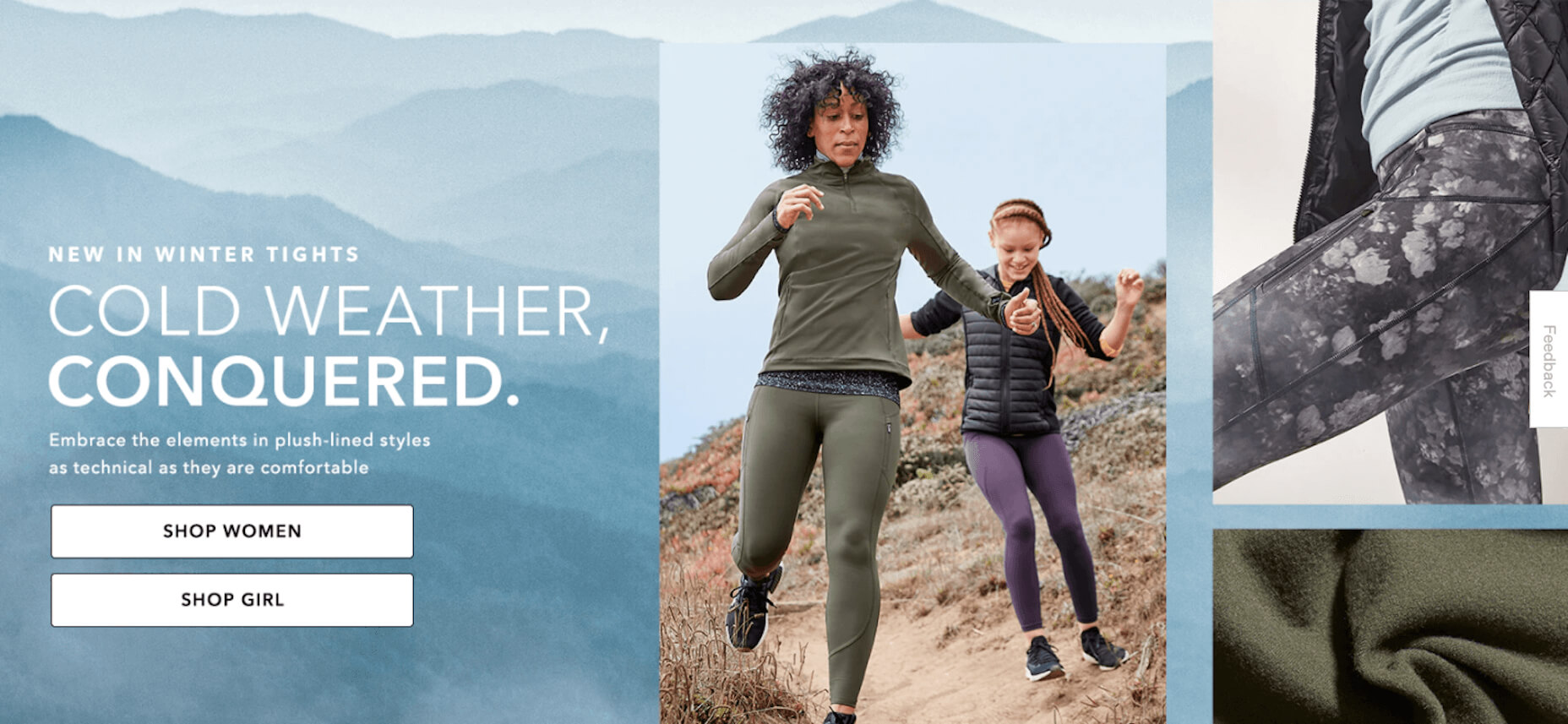
The second thing I think about when I think of Athleta is its physical imagery:
Rather than include images of the clothing on its own, there’s often someone wearing Athleta clothes while hiking along a trail, walking on a beach, or working out in a studio.
There’s so much that just these two visual elements tell us about this brand:
- Athleta targets active female consumers; we see this in its images and CTAs. The fine touches and shape of the logo may suggest this as well.
- Athleta creates understated but highly functional clothing; we see this in the product photos as well as in the brand’s use of neutral colors and fonts across its designs.
- Athleta’s mission is to help customers have a healthier and more balanced life; we see this in its product photos, but we also get a sense of this from the simple symmetric structure of the logo.
There are overt ways to use visuals in your branding (usually through your choice of photos or illustrations). But there are also ways to subtly convey more about your company, what it does, and for whom you work through your choice of colors, fonts, structure, and more.


