It’s 2023 and I’m still frequently asked by clients about scrolling. I understand why.
Every design comes with assumptions about how much content will be seen by people because the space in which people access our designs is the one thing we cannot control. Even with responsive design and scaling techniques, we don’t really know how much of what we make will appear on the screens of everyone who will look at it.
However, we do know that people will scroll.

Evidence that People Won’t Scroll…Doesn’t Exist
Over twenty-five years ago, Jakob Nielsen pointed out that web users were already becoming accustomed to scrolling, and his studies were showing a meaningful shift in that behavior that should reduce the concern that information “below the fold” would not be seen.
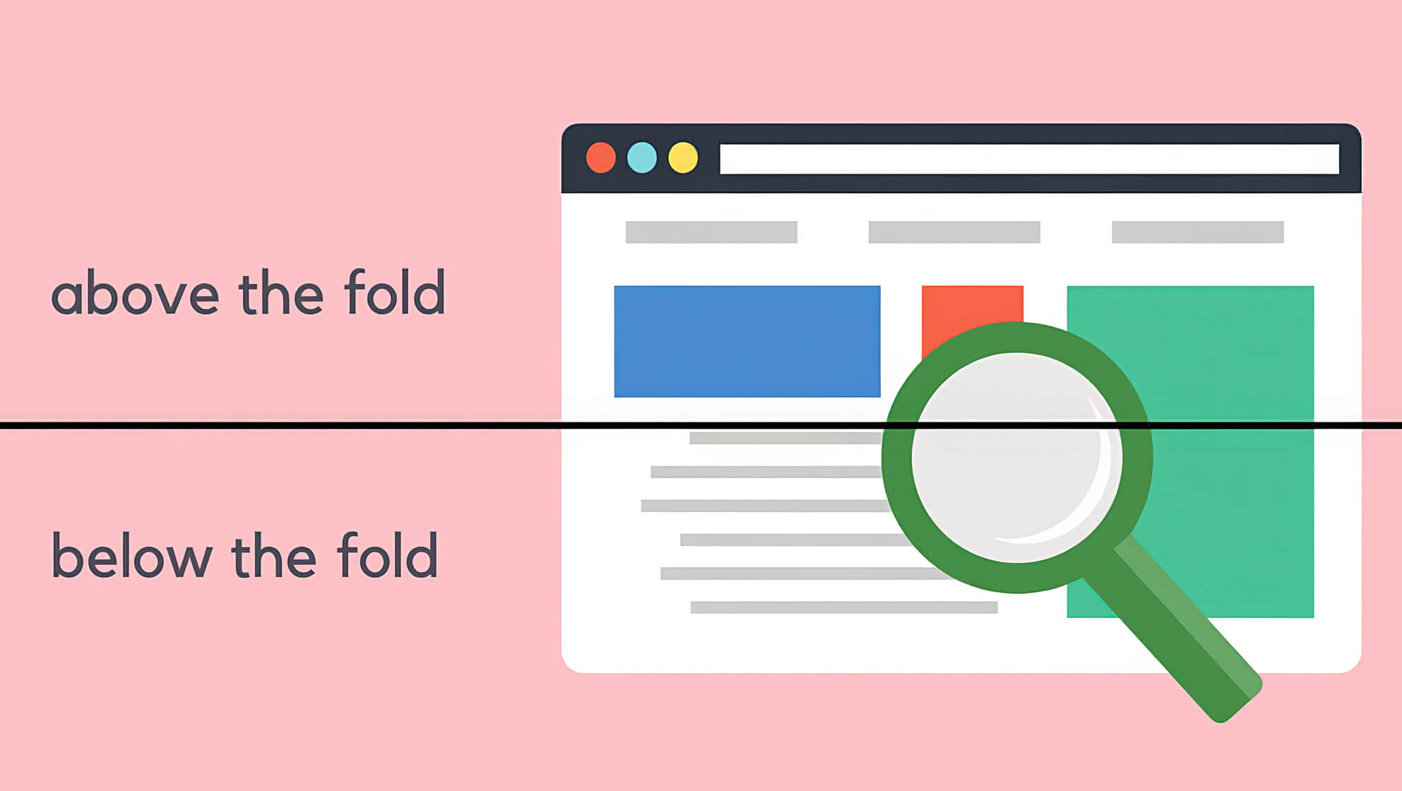
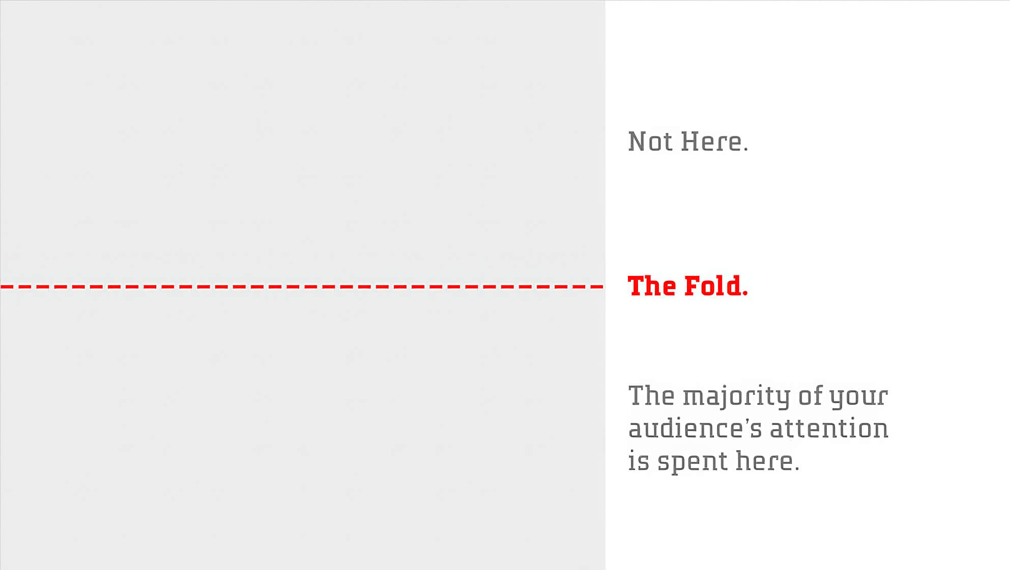
Take note, however, that in an update to that article made in 2010 and then in 2018, his firm’s eye tracking studies were showing that attention to information below the fold was much less focused. Specifically, information above the fold received 57% of a user’s viewing time and everything else — every “screenful of content” below the fold — received 17% or less. That is a significant drop. The study took into account that a web page’s vertical size is experienced differently across devices, and so they also measured pages in 20% segments. Again, the majority of viewing time was spent within the top 20% of the page.
But let’s be careful with our conclusions here. Nielsen’s studies do not show that users don’t scroll. What they show is that a user’s attention, as inferred by time spent looking at the screen, erodes quickly.
Meanwhile, in a piece written for TIME, Tony Haile from Chartbeat wrote that 66% of attention happens below the fold. Now that is interesting. What’s going on here?
What’s going on here has little to do with scrolling and everything to do with attention.

Good Interaction Design is Entirely About Managing Attention
What people do with their hands is less important than what they do with their minds.
When it comes to understanding how people engage with your designs on screens, you should be asking about attention, not scrolling. (Clicking is another matter — and not what this article is about — but I’ll tell you what: Google “heat mapping” and “rage clicks” and tell me that any of that information helps you understand people better or design more useful interfaces. It won’t.)
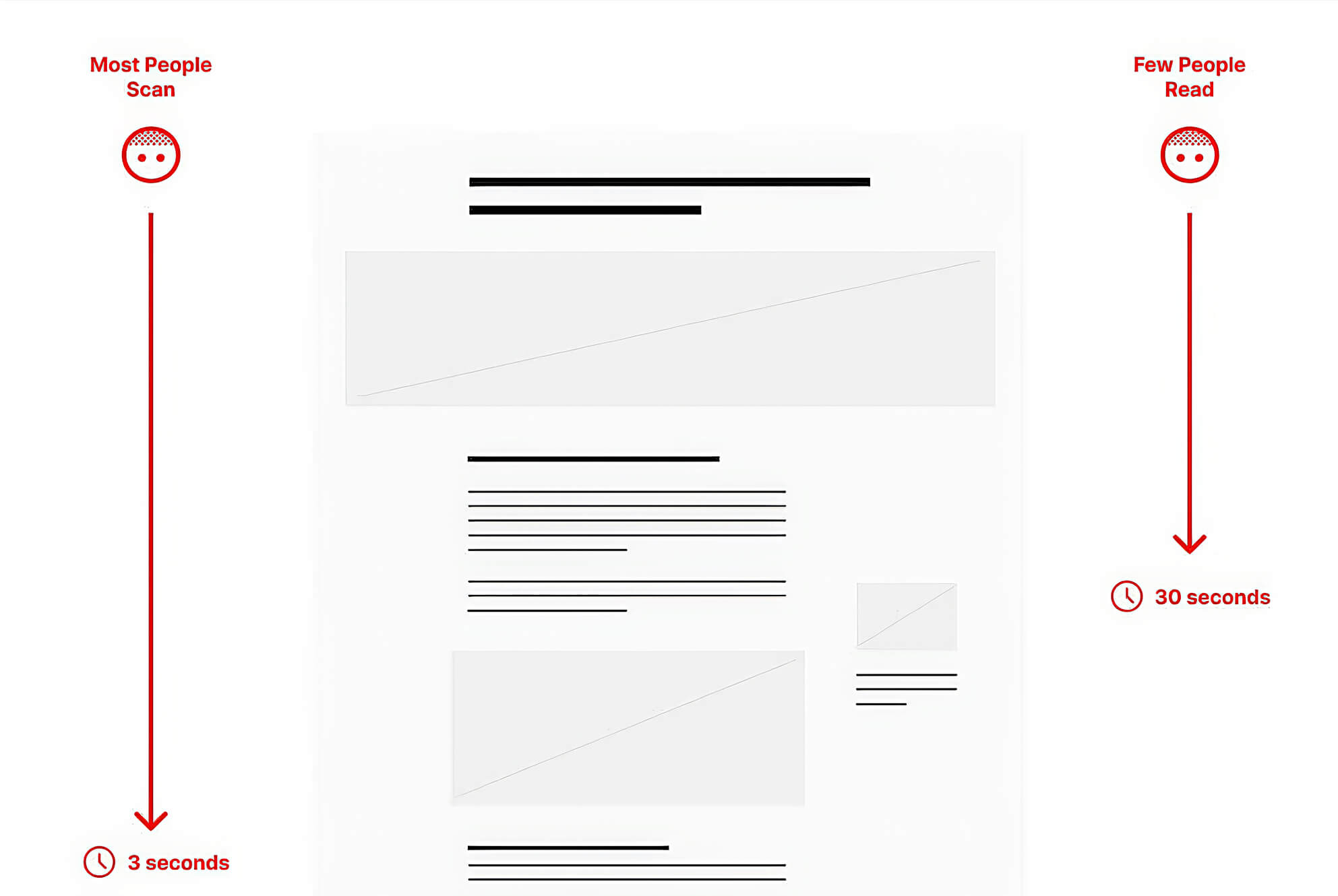
Scrolling is an inattentive act. Scanning is partial attention. Reading is focused attention.
The question is not “will they scroll?” It’s will they scroll slowly enough to process the information they see. They will do this if your design uses information architecture and visual language in a way that persuades them — on a nearly subconscious level — to give more of their attention to it.
Remember, within the first second or two of viewing your screen, people are asking and answering three critical questions:
- What is this information?
- Is it relevant to me?
- What should I do next?
Answers to those questions are reached almost entirely making subconscious judgements about visual information through scanning — assessing how a screen’s content is arranged and processing bits and pieces of it. Keep in mind that this is all happening while the elements you designed to sit still are in motion. Viewers are almost always scanning and processing while scrolling.
When a person is able to identify the nature of the information on a screen and assess its relevance they are then able to decide whether to actually start reading.

Information Architecture Matters
Where information is placed on a screen is probably the most important design decision you can make. Sizing it is a close second.
Let’s go back to the Chartbeat study that showed that 66% of attention happens below the fold. Coupled with Nielsen’s ongoing studies that conclude the erosion of attention below the fold, it appears — initially — that we have conflicting information. But remember, Nielsen’s studies measured the decline of time spent looking as a person scrolled further down a page. They did not mention — and probably didn’t measure — the speed of that scrolling, whether there were pauses, or how long those pauses were. I’d wager that the majority of an initial scroll through a page was largely unbroken. Again, that puts the majority of a page’s content in continual motion.
The Chartbeat study, on the other hand, measured the amount of aggregate attention paid to a web page’s content, and that the majority of it — however long a tail of scrolling attention segments it is — is spent below the fold. This makes a lot of sense to me.
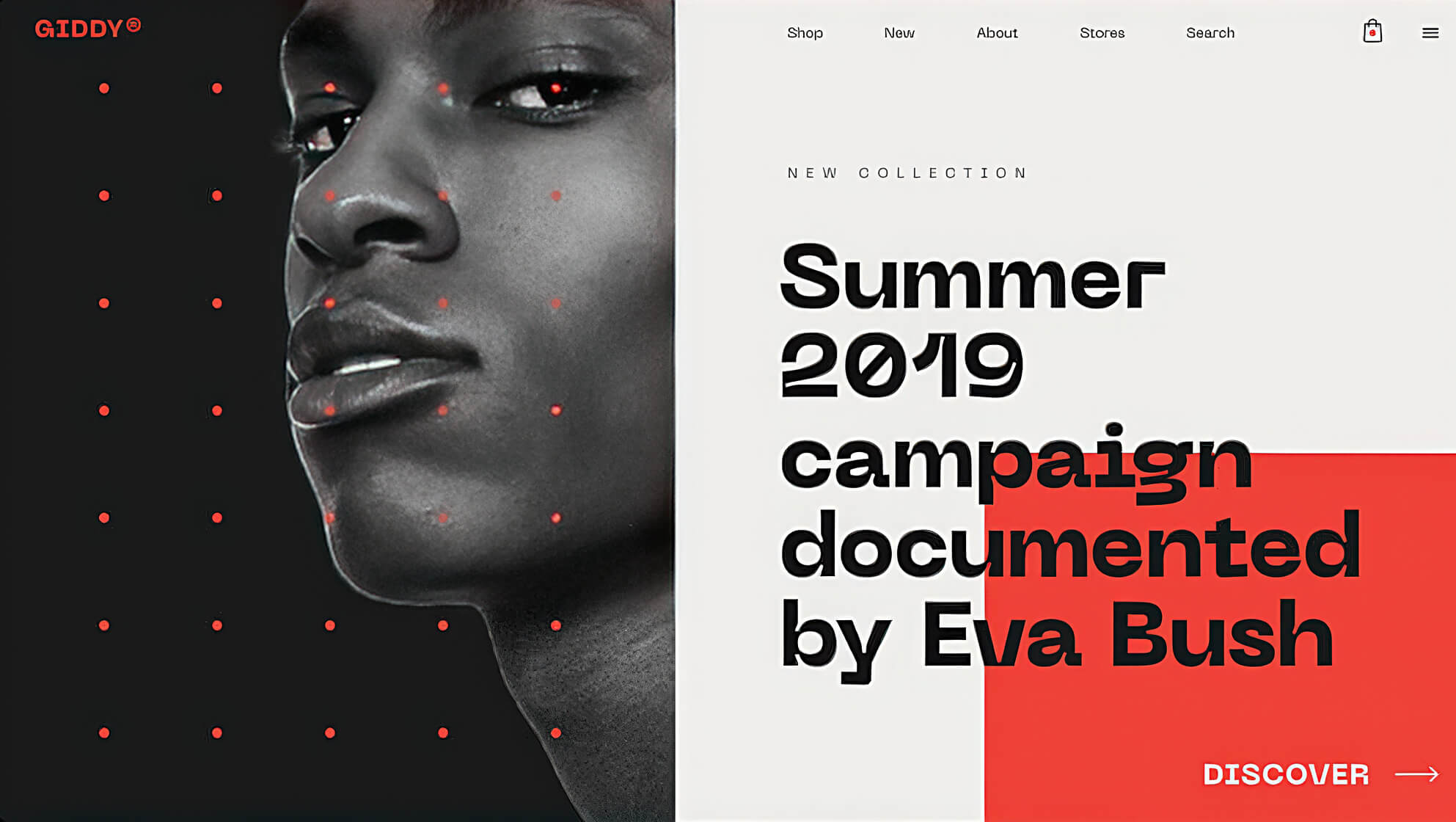
In my observation, scrolling starts immediately — even before all the screen’s elements can fully load. People are accustomed to the cloying, top-crowding design choices made to capture attention above the fold, and the resulting disarray that comes from it. Per Chartbeat’s conclusion, they often scroll right past the first “screenful” and settle below, where there is more space, less information, and more clarity.
This is why I so frequently compare good information architecture to the simplicity of a text outline. A productive scan of information will lead to conclusions about what the information is and what is important based upon how it is arranged.

So, a few simple tips:
- First, remember that scanning is a reaction; reading is a choice. The majority of people who look at your screens will never read their contents.
- Anchor your most important information in a consistent place. For example, since most text is left-aligned, consider maintaining a left-alignment of text (with imagery floating right) so that a user can more quickly process that information by maintaining their scan on a single axis.
- Repetition is information. Repetition of smaller structures and arrangements helps a scanner understand the larger structure of your screen’s contents. Being able to immediately identify a list, for example, helps a scanner understand how some content supports other content as well as recognize potential choices and actions available to them.
- Empty space is not neutral. Intentional use of space enables scanners to quickly identify clusters of related information, as well as gives a scanner the ability to process the information they see. The less empty space a screen has, the greater its information density. The greater a screen’s information density, the less porous it is to attention and understanding.
Each of these tips has two important things in common.
The first is that they all relate to structure. These ideas will help the choices you make for where to put information lead to a greater ease in engaging with it. The second thing they have in common is that, when they work together, they create the rhythm of your screen.
Length is not the problem; lack of rhythm is.
Your screen can be as “long” as it needs to be. Length is not the problem; lack of rhythm is. When you establish a structure, you can imbue that structure with rhythm. The rhythm of a structure is defined by the repetition of arrangements and the spaces between them.
A screen without intentional rhythm will lose attention as it is being scanned. One with controlled rhythm will not only retain attention, it will deepen it.


