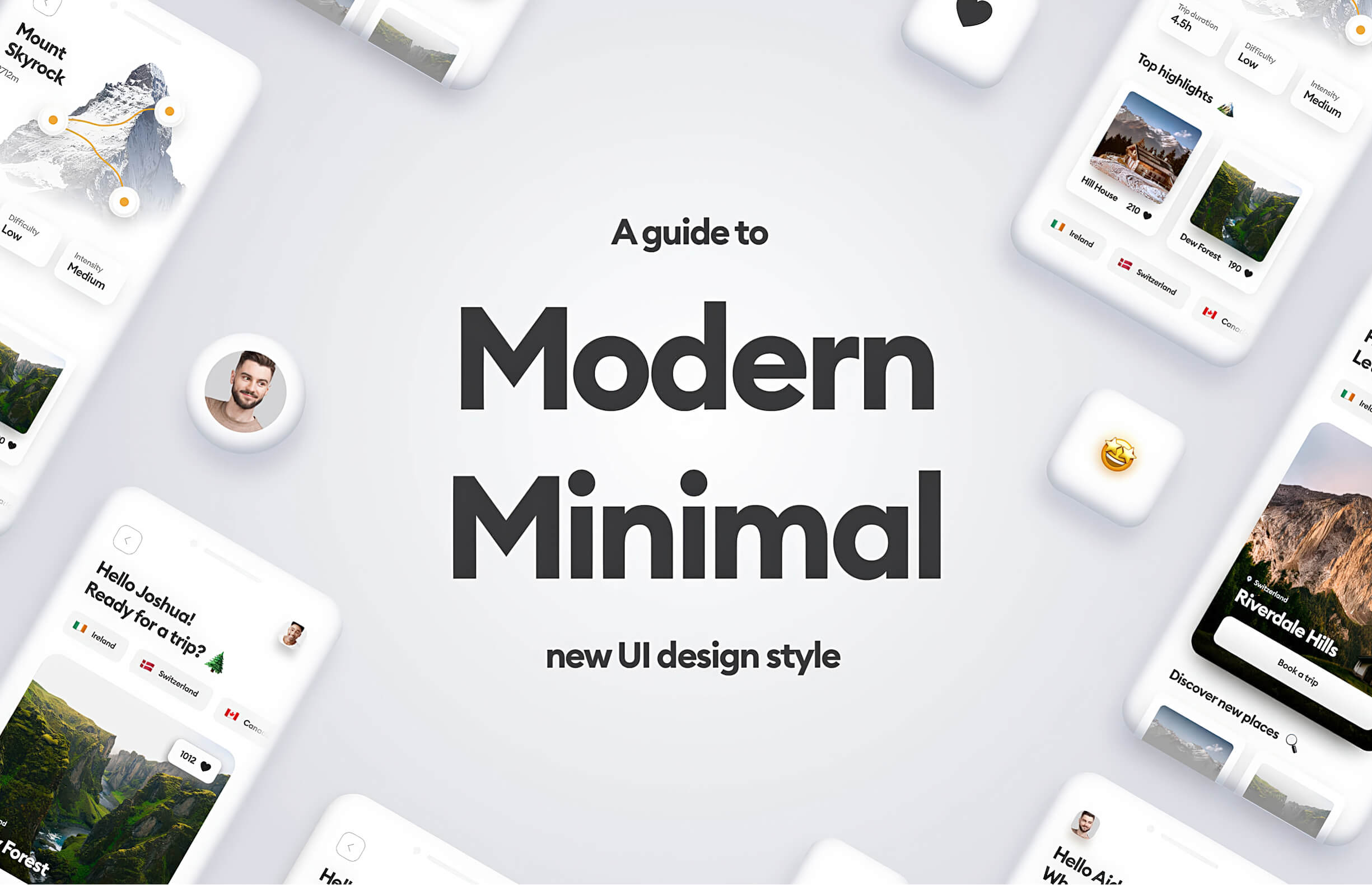
There wasn’t a thing like this one until a long time and I feel like I’ve been waiting for a new, functional, and visually appealing design style to emerge. And it stole my heart completely.
I’ve been witnessing similar design style patterns in many interfaces. These interfaces looked extremely good — they were eye-catching and readable but friendly and not too extravagant. I thought they were a perfect in-between of being good-looking and functional at the same time.
Because that’s the main problem with design trends — they look mesmerizing, but you can’t really make a fully functional product using them (no doubt that neumorphism or glassmorphism is not accessible enough to use on a daily basis).
So, I called this design style “Modern Minimal”. It’s minimalistic comparing to the other design styles, but at the same time is not as dull and boring as old Material Design or Flat. You can spot many inspirations from the different styles in it (like skeumorphism and glassmorphism, even!) but as you will see, it all works together and it doesn’t exceed certain level of visual complexity.
The characteristics
I did some visual representation of mobile screens in Modern Minimal design style, to show you the most significant factors of it. In general, Modern Minimal style embraces the following characteristics:
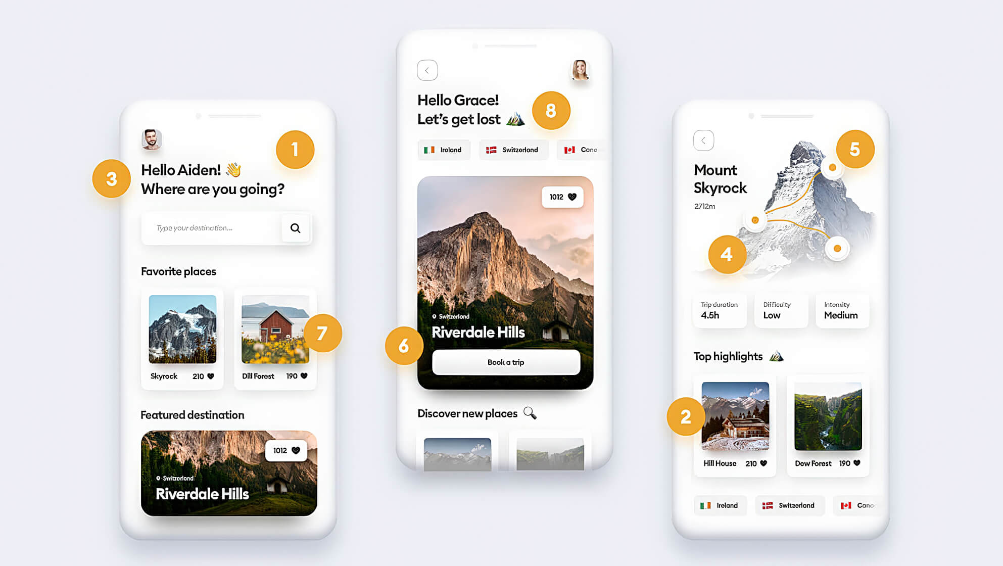
- Bright backgrounds and whitespace
- Subtle roundness on UI elements
- Big, readable headings
- Real-life photography
- Thoughtful use of colors
- Focus on contrast
- Limited use of effects
- Small details, often illustrated
Examples
1. Bright backgrounds and whitespace
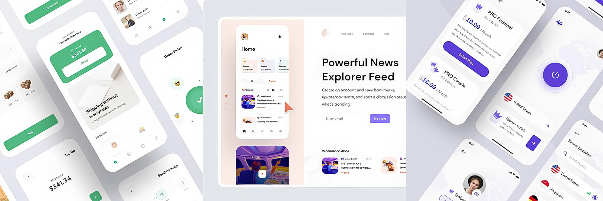
In modern minimal, the whitespace is king. The whole content of the interface is most often presented on a white or a very bright background. The thoughtful use of whitespace makes the interface look clean, fresh and aesthetically pleasing in general.
2. Subtle roundness on UI elements
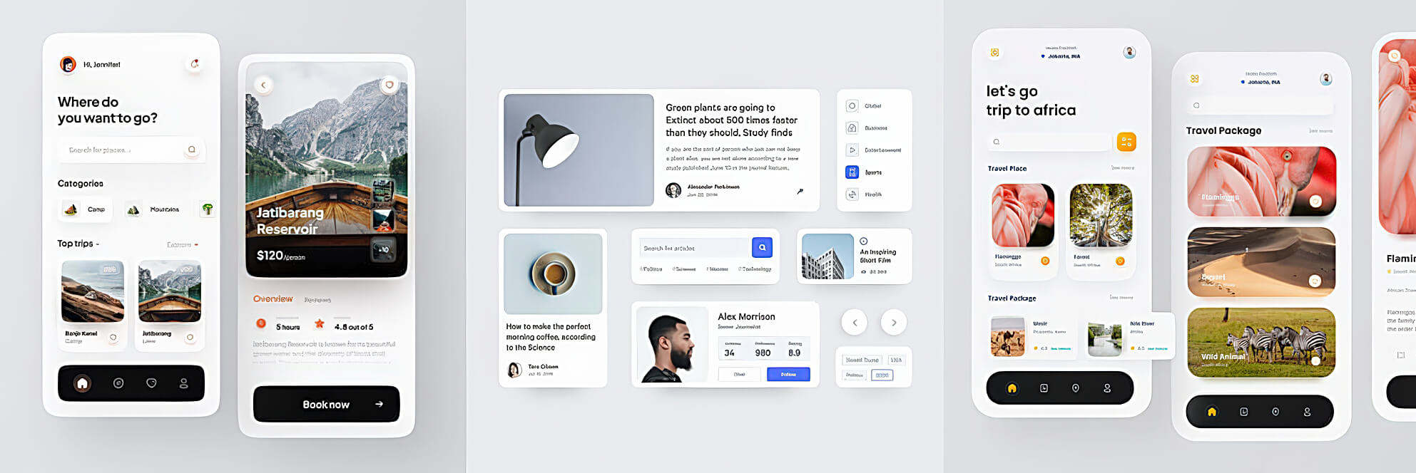
The UI elements in Modern Minimal style are subtly rounded. It makes the interface look more organic and friendly.
If you know the latest craze called Clubhouse, you’re probably familiar with their rounded avatars. They make the whole product look more original and distinctive!
Personally, I’m a big fan of rounded corners (they are more pleasurable for our eyes contrary to the sharp ones). The trick is to not overuse the roundness, but rather save it for certain elements, like buttons and containers. The radius of the corners shouldn’t exceed certain values (better slightly than fully rounded — this rule doesn’t apply to the full rounded buttons though).
3. Big, readable headings
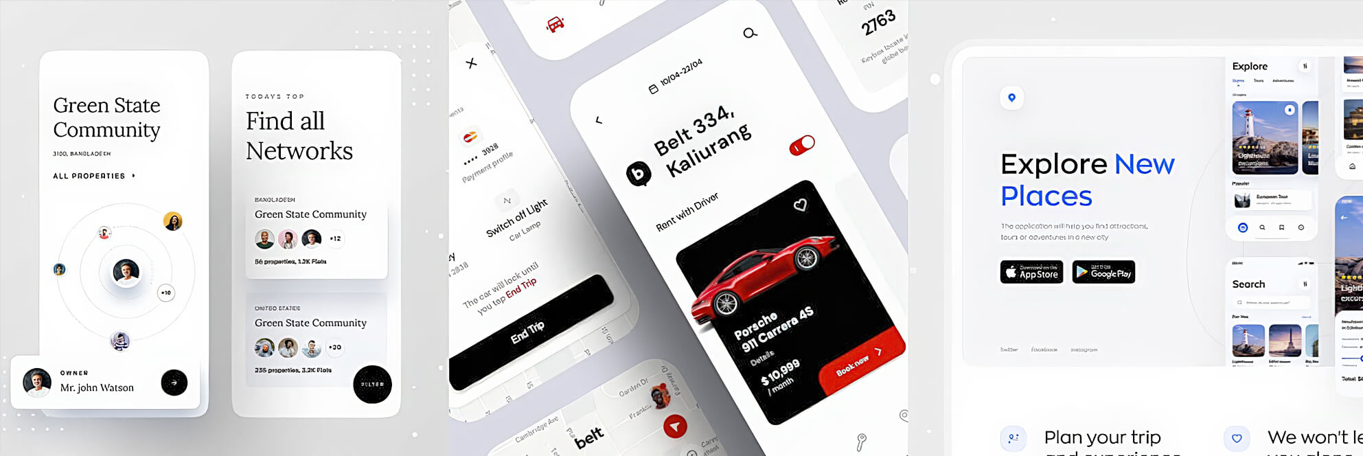
I love those big, fat headings! They are also making the interface look more modern. You can choose between sans-serif or serif, but personally, I’d recommend sticking to the popular geometric sans-serifs like Gilroy, Sofia Pro, Lufga, or Circular. You can also try Pulp, Gordita, Visby, Konnect, Geliat, Galano or +Jakarta Sans.
