What Makes a Good Logo?
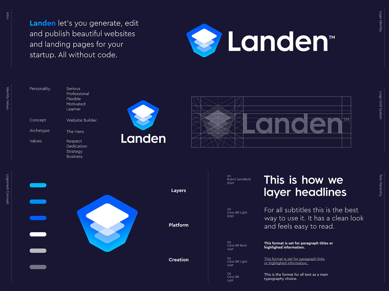
The logo shows who you are — even better than your product does. It reflects your state of mind, the attitude to the business and helps the customer decide on whether they are willing to proceed with your company or not.
That’s why it’s wrong to think that a logo is a simple thing to design — like you pick up a nice template from Creative Market or a pretentious calligraphy font and that’s it. In fact, either of these solutions is not ‘yay’, because:
A logo is not a template. It can’t be anything cookie-cutter. If your company is reserved/kitschy/sophisticated, that’s what the logo should be packed with. It should exude your aesthetics, and logo templates are not the best solution to showcase it.
A logo is not a font. So you can’t just write your company’s name with the font you liked — otherwise it’ll just be your company’s name written with some dude’s font. Mind the anatomy of a logo, which should include the logo mark and the logotype at least.
Instead, opt for a hand-drawn logo. A custom logo. A logo that’ll rather tell about you than about the designer who created it.
Does a Responsive Logo Still Make Sense?
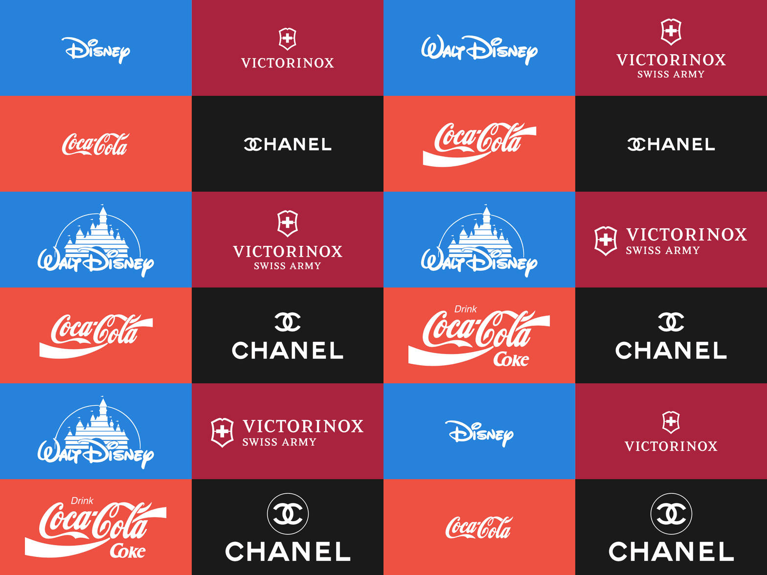
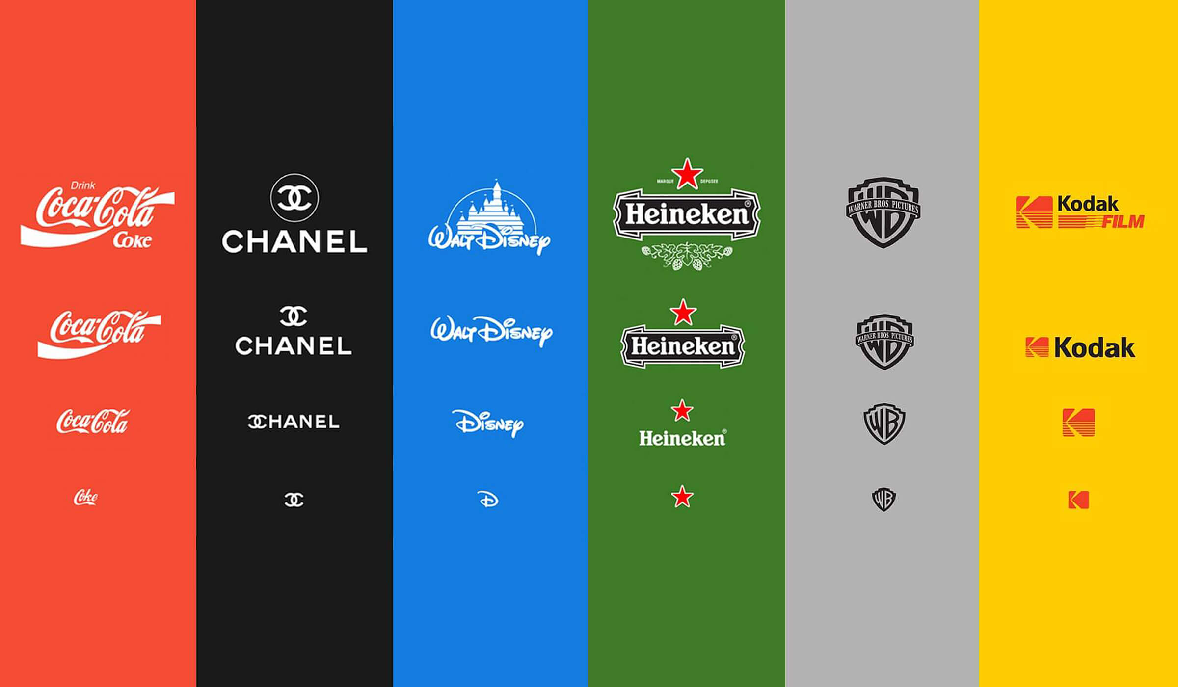
The design community has finally stopped concerning that by modifying a logo they’re likely to lose the core of the brand identity. Giants like Pepsi, Slack, Google, Jaguar, Kodak and many more have proven that the logo is the company’s face that’s fully variable, that can be different and adapt to situations and backgrounds.
The new thing we should admit is that a responsive logo is not a trend everyone should implement in their design system. Today, it’s rather a feature that your business/logo needs. In other words, if the logo will be displayed on various platforms, it makes sense to think over a responsive one. And, on the contrary, if the logo looks natural in a different environment, there is no strict necessity to make it responsive.
Modern branding is all about individuality — yours and your customer’s. That’s why there can’t be any one-size-fits-all solution for all cases. Consider your business’s needs, not trends.
What’s a Variable Logo?
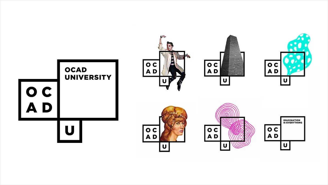
Responsive logos allow you to translate your brand’s identity across platforms. Variable logos allow you to speak different stuff to different audiences. They help businesses build a stronger connection with the target groups and be more convincing in delivering a message. To fulfill the task, variable logos come as a sort of a constructor, where the separate elements change depending on the marketing campaign.
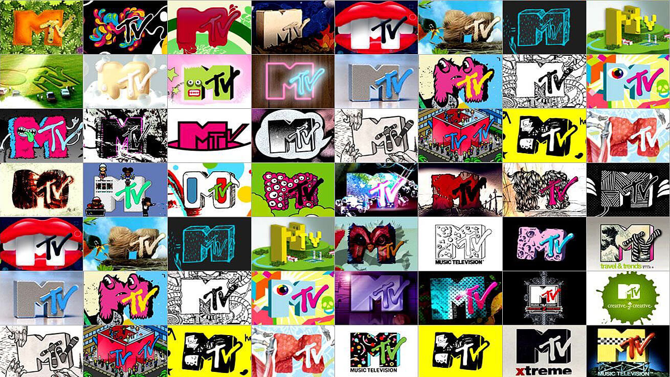
The idea of variability in logo design isn’t new, and you may remember the MTV logo, which had multiple alternatives for different music, shows, seasons, events and even times of the day.
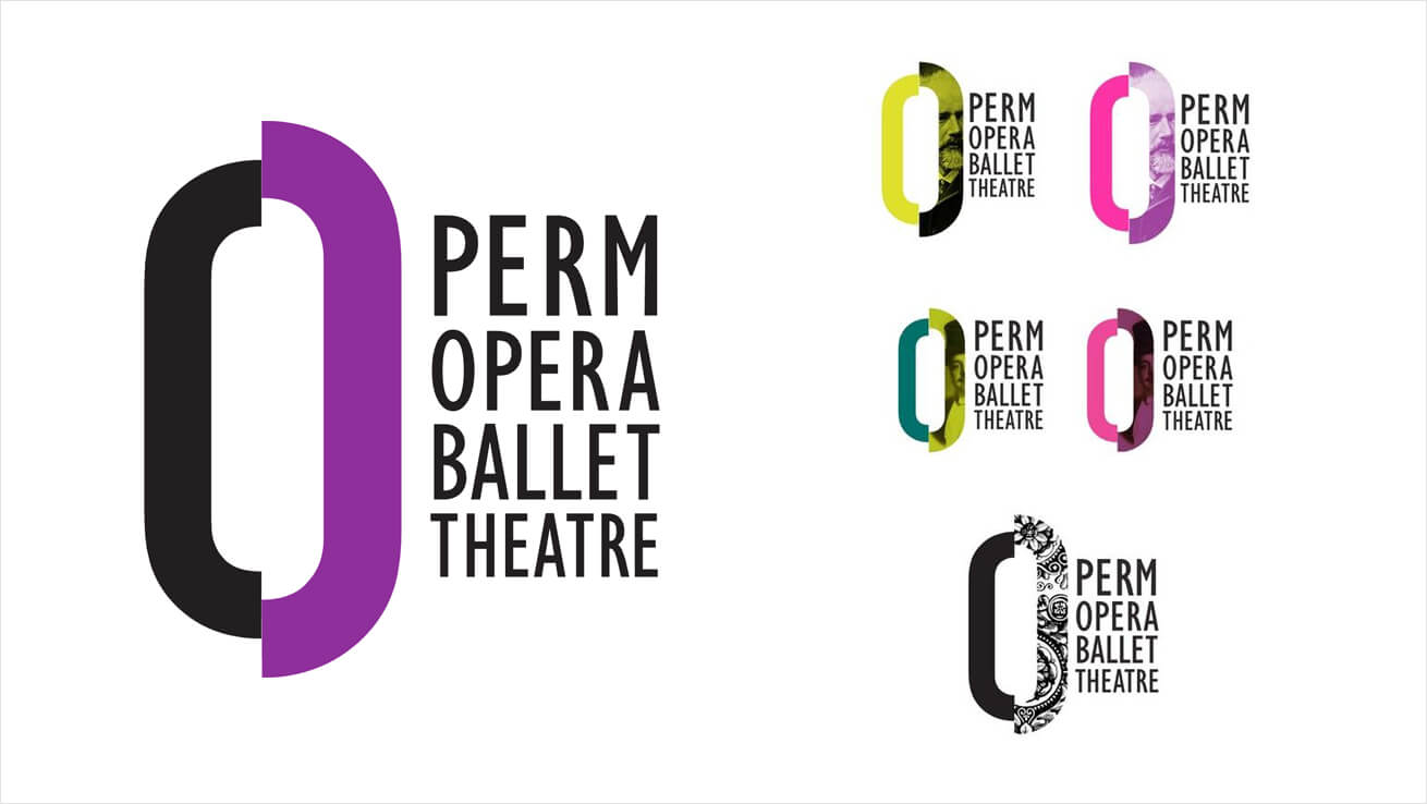
However, the deeper understanding of variable logos came in 2012 with a rebranding project Perm Opera Ballet Theatre, which turned into a design scoop. The team headed by Elena Kitayeva has elaborated a logo mark that is updated for different stage productions and alternate between a variety of images, patterns, and colors — depending on who they’re addressing and who they want to attract.
Can I Use a Variable Logo?
The flexibility of the variable logo design is what makes everyone want it. In an attempt to personalize the relationship with consumers, companies explore this trend and take up the challenge of adaptability. Iconography, dynamic typography, and vast customization features help frame genuine connections to an audience’s specific needs and showcase the brand’s multifaceted nature.
For this reason, variable logos have become particularly within museums, art galleries, theatres and universities/schools — and all sorts of cultural institutions that have a very heterogeneous audience, from millennials to creative specs, and an even more heterogeneous content to display. Asian Art Museum, Musei di Pistoia, OCAD University, and many more prove it.
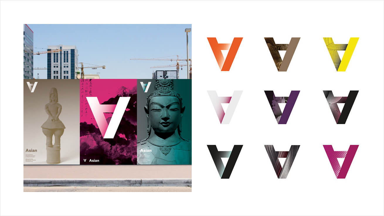
However, variable logos can be applicable to a wider variety of projects, which means they aren’t a museum-only thing.
+ Do you have different kinds of customers who use your product?
+ Do you have different products for different audiences?
+ Do you have seasonal/timely offers that stand out from the stuff you normally do?
+ And, most importantly, do you have enough resources to elaborate and constantly update a set of logo marks for different purposes?
+ If you do, what’re you waiting for? Go for it.
There’re many ways to create a fine logo, and I’m sure you’re aware of them: from going responsive to picking a logo template that’ll truly reflect your personality. Variable logos are just another way (a great way, I must say) to tell about your brand and meet the customer. And in 2020, when everyone talks about humanity in design, they’re the best way to reach it and get as close to your audience as you’ve hardly ever been — just don’t forget that being unique and avoiding cookie-cutter solution is a trendy trend too.
