Two of these three trends comes with some usability concerns but are a lot of fun to look at and play with. Would you take the risk of trying one of these design techniques? The third trend (up first in this list) is a new take on bold color palettes that shifts from some of the colors that have been overwhelmingly popular for a while.
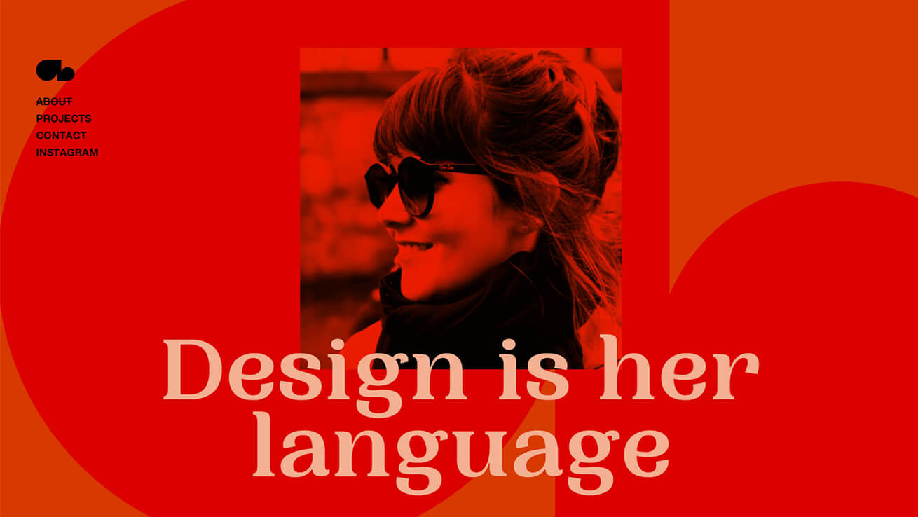
Warm Colors, Especially Reds
As a point of reference, warm colors are vivid and bold and can sometimes be overwhelming because they can occupy and fill space will a feeling of fullness. Warm colors include reds, oranges, and yellows. They are all on the same part of the color wheel, which can be divided into warm and cool colors (blues, greens, and purples).
The nice thing about these warm colors is that they are bold without the same levels of brightness that have been popular for a while. They aren’t as overpowering as brights on smaller and darker screens and really set a different tone for the design that’s a little more serious.

Full-Screen Heroes
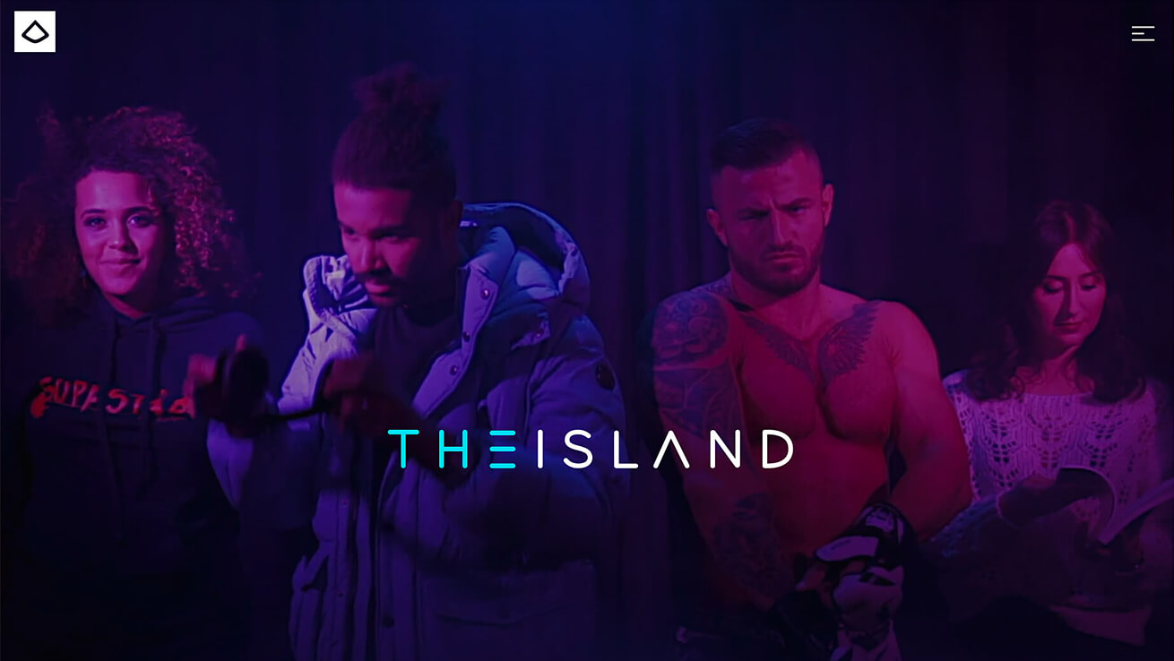
An oversized hero image is nothing new. But hero headers that occupy the entire home screen are.
The trend also seems to come with another new element — no obvious navigation or need to scroll (although it’s often there). The result is a trend with super clean designs, with the possibility for design or usability challenges.
This trend works for one reason: Thanks to mobile usage, people are getting more accustomed to (or trained) to scroll. Small screens make it a way of life and this trend is relying on that to work.

Neumorphism
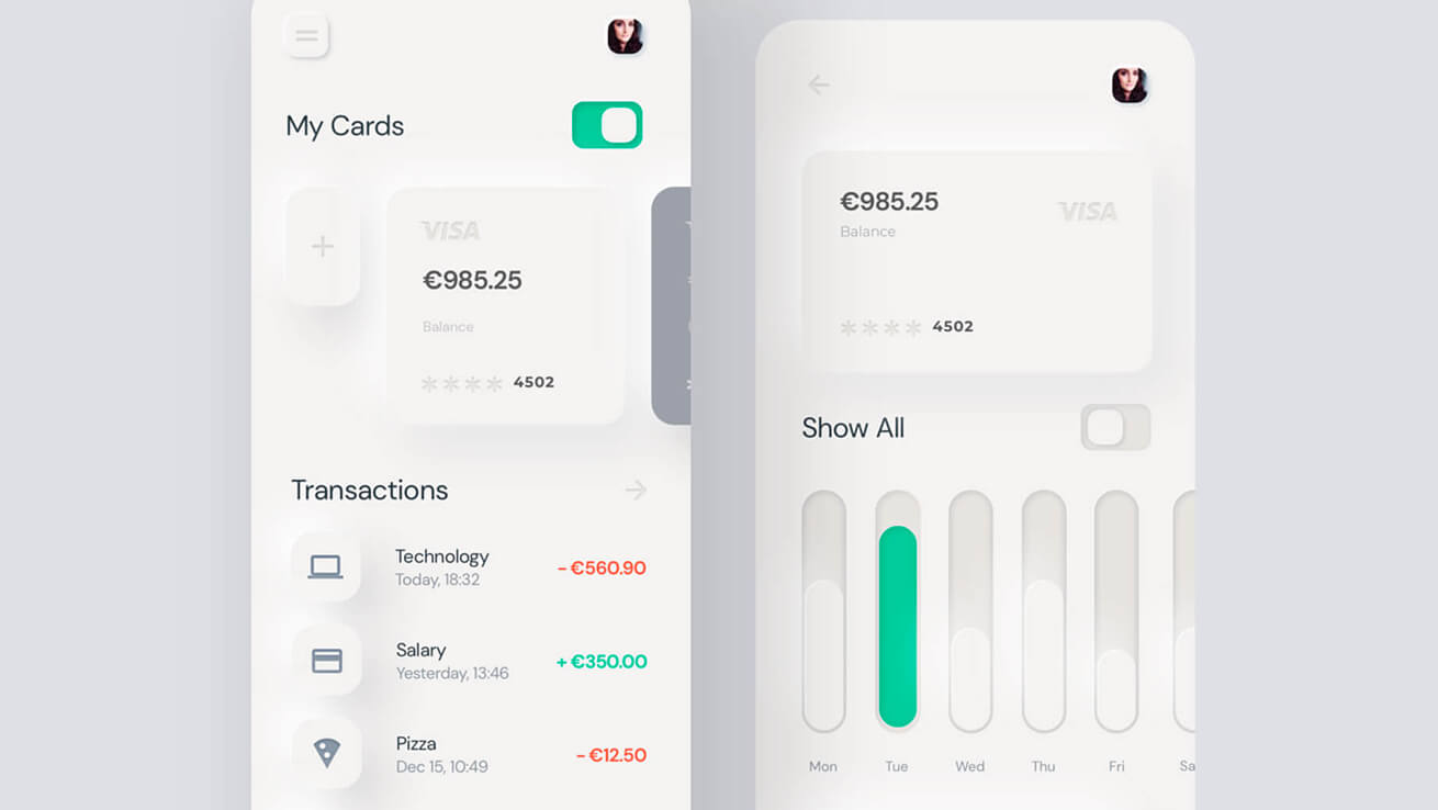
This trend is one that is a mash up of popular web and app design techniques that’s starting to show up most commonly in app concepts.
Neumorphism (or new skeuomorphism) can be traced to an analysis by Michal Malewicz of Hype4 who did a nice deep dive into what this trend is (and isn’t) and how it works for designers. Neumorphism seems to be most popular when designing card-style interfaces.
The style can be identified by use of inner- and outer shadows to create an illusion of softer shapes that seem to lift off the background canvas.


