Design Principles are an assortment of considerations that form the foundation of any good product design. You can find many articles online listing various principles, but often they lack concrete examples from products we encounter daily. Here are ten principles that can help you create more usable, effective, and immersive designs.
The Flexibility-Usability tradeoff
As the flexibility of a system increases, its usability decreases.
Flexible designs support more functions and satisfy a wider set of requirements, but they perform those functions less efficiently than specialized tools.
When balancing flexibility versus usability, consider how well the needs of the users are understood, and how likely they are to evolve or change. Flexible products come with significant costs in terms of complexity, usability, adoption time, and investment requirements.
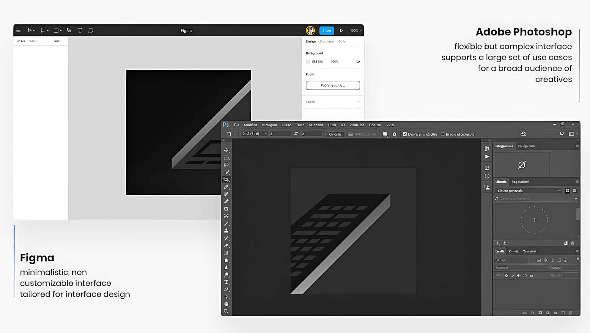
Adobe Photoshop is widely used by designers, graphic artists, photographers, and creative professionals. With every new version of the Photoshop feature set was expanding to accommodate a larger set of use cases, this resulted in a highly flexible but complex user interface. On the contrary, Figma is purposefully built for UI design and has a very lean feature set. Its minimalistic interface can be fully leveraged without much training.
The Aesthetic-Usability Effect
Users have a tendency to perceive aesthetically pleasing designs as more usable. We tend to believe that products that look better will work better — even if they actually don’t.
In 1995 after testing 26 variations of an ATM UI, asked the 252 study participants to rate each design on ease of use, as well as aesthetic appeal. Researchers Masaaki Kurosu and Kaori Kashimura found that users are strongly influenced by the aesthetics of any given interface, affecting their perception of ease of use.
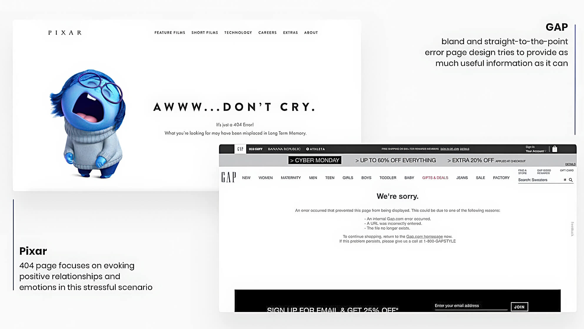
The GAP error page is quite usable in terms of, not using unfamiliar for a user’s error codes like “404” and listing possible reasons of why the error occurred. In addition, the page has a clear call to action and support contacts. Opposite to bland and straight-to-the-point Gap page, Pixar’s 404 page focuses on evoking positive relationships and emotions in this stressful scenario. Using a much richer visual and playful character from their universe they try to make you smile.
Forgiveness
Products, services, and opportunities become more desirable when they are perceived to be in short supply or occur infrequently.
Brands use the scarcity principle to persuade people to purchase a product or take another desired action. Few principles move humans to action more effectively than scarcity.
Many physiological phenomenons contribute to this principle effect. Fear of missing out (FOMO) — the feeling of apprehension that one is either not in the know or missing out on information, events, experiences, or life decisions that could make one’s life better.
To the point where there are whole categories of products that are called “Veblen good” – a good for which demand increases as the price increases, because of its exclusive nature and appeal as a status symbol.
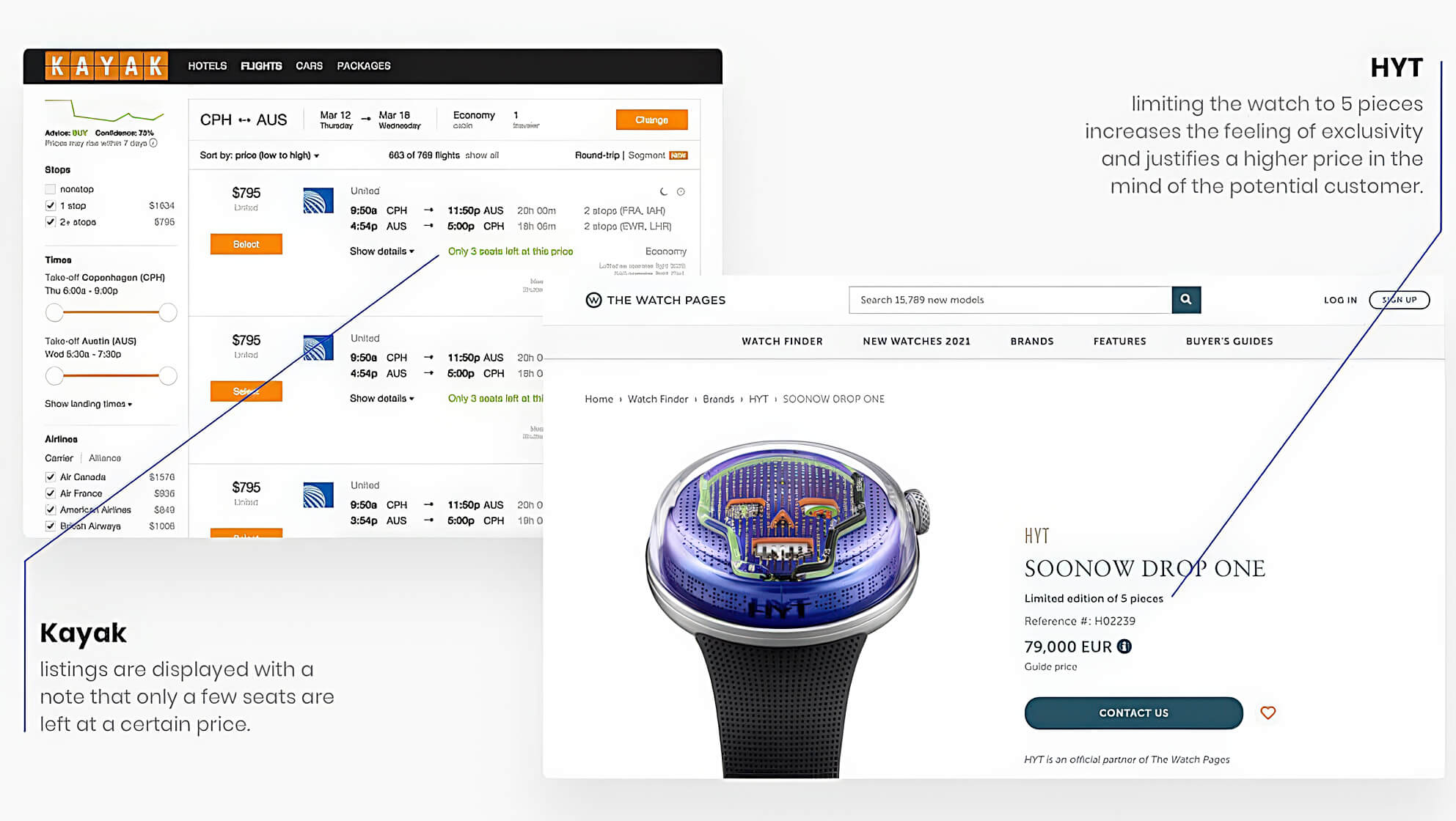
On the majority of travel booking sites, such as KAYAK or Booking, listings are displayed with a note that only a few seats/rooms/items are left at a certain price. New HYT watch limited to 5 pieces, is a classic “Veblen good” example that may sell better at 2–3X cost due to a perceived feeling of exclusivity.
Scarcity
Products, services, and opportunities become more desirable when they are perceived to be in short supply or occur infrequently.
Brands use the scarcity principle to persuade people to purchase a product or take another desired action. Few principles move humans to action more effectively than scarcity.
Many physiological phenomenons contribute to this principle effect. Fear of missing out (FOMO) — the feeling of apprehension that one is either not in the know or missing out on information, events, experiences, or life decisions that could make one’s life better.
To the point where there are whole categories of products that are called “Veblen good” – a good for which demand increases as the price increases, because of its exclusive nature and appeal as a status symbol.
On the majority of travel booking sites, such as KAYAK or Booking, listings are displayed with a note that only a few seats/rooms/items are left at a certain price. New HYT watch limited to 5 pieces, is a classic “Veblen good” example that may sell better at 2–3X cost due to a perceived feeling of exclusivity.
Signal to Noise ratio
the ratio of relevant to irrelevant information in an interface or communication channel.
Human-computer interaction is based on the transmission and reception of information. Any excessive styling or information that is presented inefficiently or inappropriately degrades the signal and adds noise to the designs. A high signal–to–noise ratio is a key goal for any UX designer.
Signal degradation occurs due to many reasons: absence of hierarchy, information overload, highly stylized typography or charts, unclear icons, and inappropriate visuals, etc.
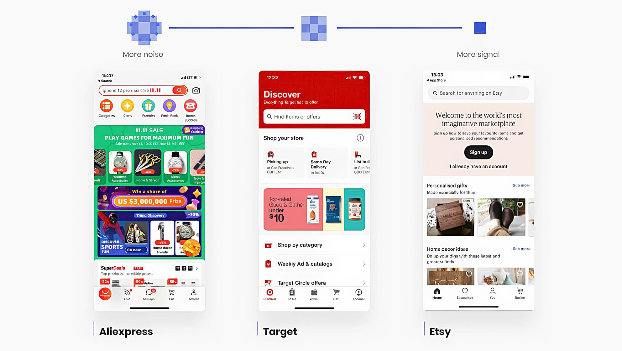
Bellow, we see 3 examples of mobile e-commerce homepages with varying levels of noise. Aliexpress app manages to display a ton of information, links, and calls to action. Unfortunately, this paired with bright UI and flashy backgrounds result in excessive noise that makes it almost impossible to focus on something specific.
80/20 Rule
also known as the Pareto Principle, states that a high percentage of effects in any large system are caused by a low percentage of variables.
You can see this principle affects almost everywhere. Although the 80–20 axiom is frequently used in economics, you can apply the concept to User interfaces, quality control, and engineering.
Here are some examples. Approximately:
- 80% of product’s usage involves 20% of its features
- 80% of errors are caused by 20% of components
- 80% of company revenue comes from 20% of its customers
- 80% of progress comes from 20% of the effort
- 80% of ideas will come from 20% of people
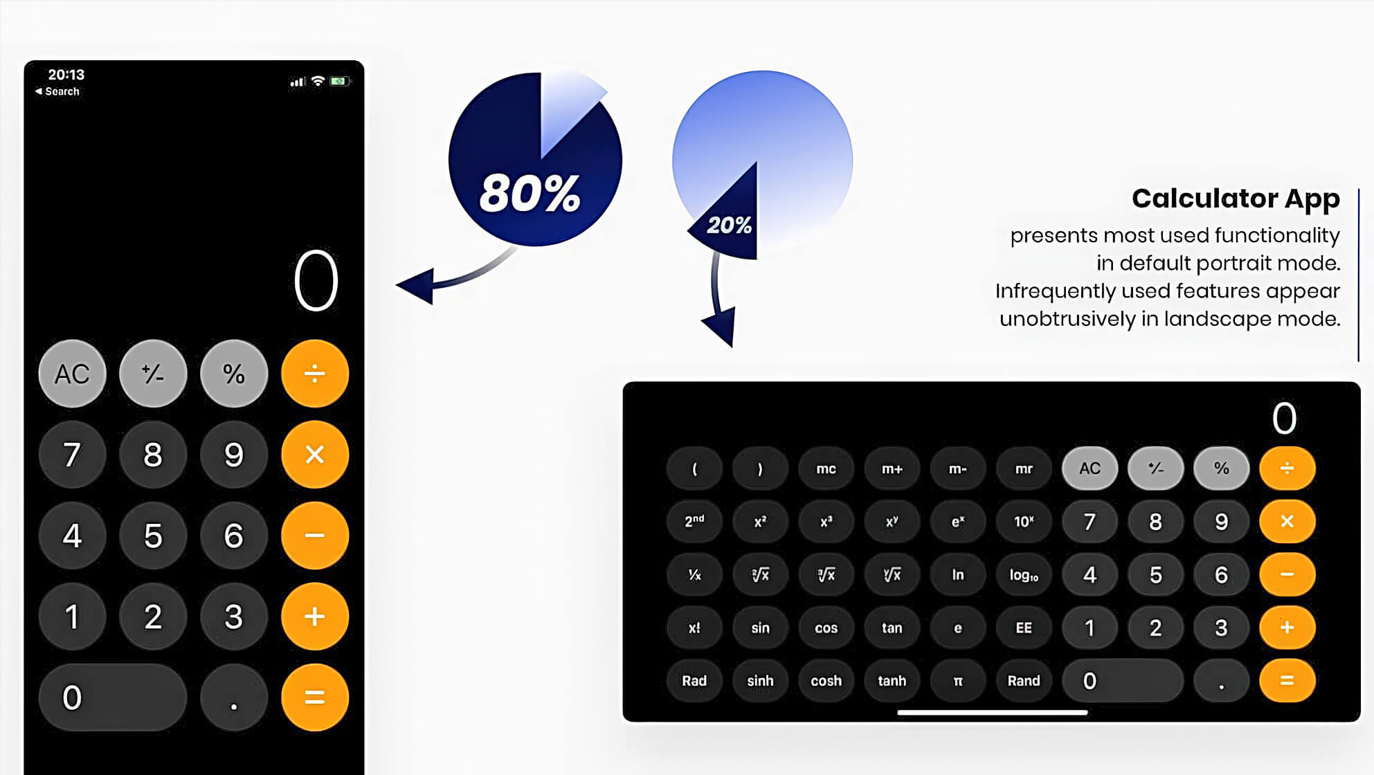
iOS Calculator app takes full use of the 80/20 rule. Key calculator features that correspond to the lion’s share of users’ tasks and usage volume are accessible in default portrait mode. Infrequently used features appear unobtrusively in landscape mode.
